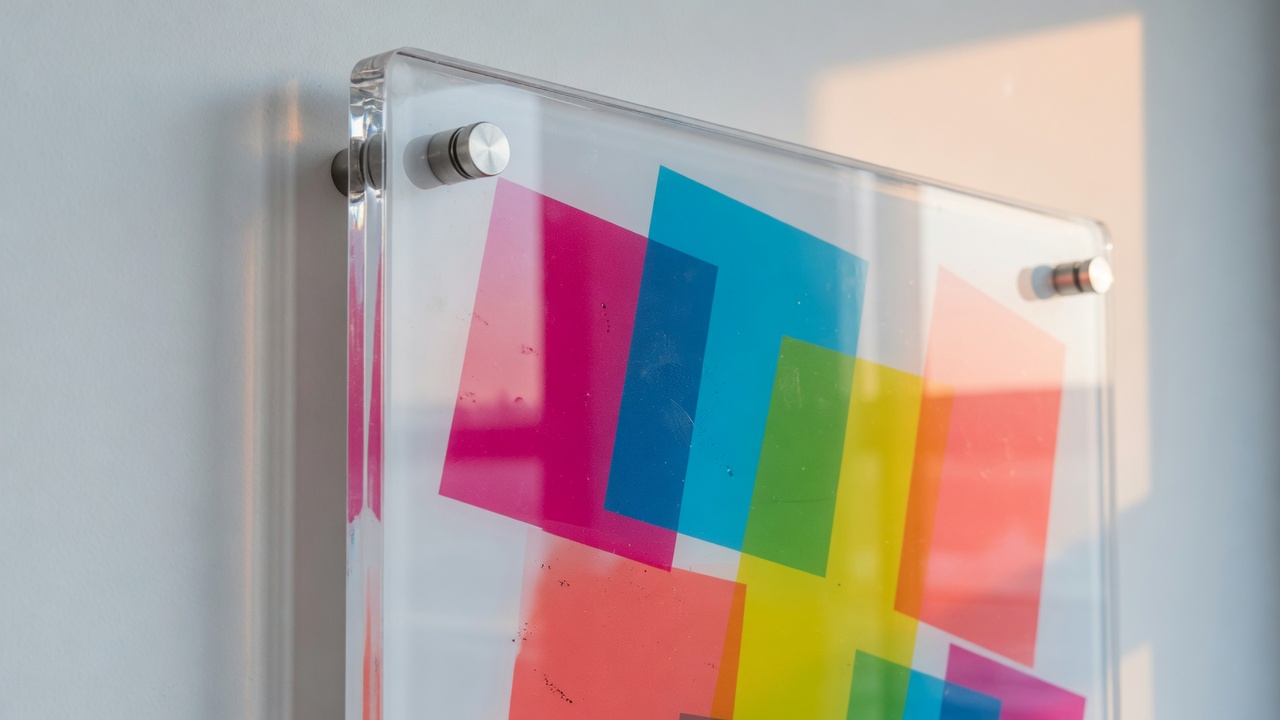
If you need UV printing on acrylic near me in Irvine, you want a flatbed that prints UV-cured ink straight onto the sheet—not vinyl stuck on plastic. Avanti Printing at 15321 Barranca Pkwy runs that work on a 4×8-ft bed. Confirm size, sheet color, thickness, quantity, finish, and due date on the quote.
This is a substrate guide, not a catalog page. You are choosing how the panel will look on a wall, in a window, or on a reception desk, and those choices are mostly locked in before anyone hits print. Get the sheet, the ink stack, and the hardware right and the panel looks like it belongs in the building. Get them wrong and you own a shiny rectangle that bows, scuffs, or reads like a sticker.
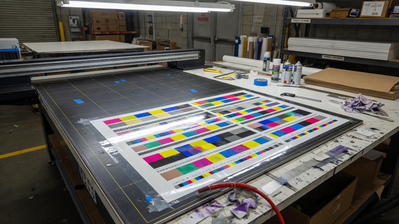
We print this work on an Océ Arizona 460 GT. The bed takes rigid stock up to 4×8 feet and up to 2 inches thick, which is far thicker than any acrylic sign you should actually hang. Most Irvine jobs land on 1/8, 3/16, or 1/4 inch cast sheet. The rest of this article is how to pick among those, how white ink behaves on clear versus opaque acrylic, and when you should stop asking for acrylic and move to aluminum or PVC.
Who this is for in Irvine and Orange County
You are probably not shopping “art acrylic” for a living-room photo. You are a facilities manager, a dental or medical office coordinator, a retailer at the Spectrum or along Jamboree, a restaurateur who wants a rigid menu or brand panel, a property manager who has to keep tenant IDs consistent, or an owner who walked into a print shop, pointed at a clear sample, and said that. All of those buyers end up at the same counter: they want flatbed UV printing on rigid sheets that looks closer to glass than to a mounted poster.
Irvine and the surrounding Orange County cities are heavy on leased interiors. That matters more than the printer model. In an Irvine Company office park, a University Research Park lab building, or a medical suite on Barranca or Alton, you often cannot drill the corridor, you may not control the lighting, and someone else wrote a sign program before you leased the space. Inside the suite you have more freedom. On the glass at the reception desk you have a different problem: the panel is viewed from both sides, and every fingerprint on a polished edge will show.
Drive-in radius is simple. We are at 15321 Barranca Pkwy, Irvine, CA 92618. Call (949) 387-0787. Buyers from Tustin, Costa Mesa, Lake Forest, Laguna Hills, and the John Wayne Airport office corridor treat this as a local job. If you need the panel crated and shipped, say so up front. Acrylic chips on corners when it rides loose in a box, and a polished edge that took time on the buffer does not survive a bad pack.
This guide stays on direct-to-acrylic UV. It is not a tour of every lobby material, and it is not a banner article. If your project is actually a painted aluminum panel, a PVC board, or a window graphic, say that in the quote instead of forcing acrylic to do work it does not want.
Clear, white-backed, or colored acrylic
Start with the sheet, not the file. The same CMYK art looks like three different products on clear, on opaque white, and on a colored or frosted sheet. If you send a PDF and write “acrylic” in the email, you have not specified the job.
| Sheet | What you see | White ink | Typical Irvine use |
|---|---|---|---|
| Clear cast | Glass-like body; wall or window shows through unprinted areas | Required under color unless you want a stained-glass effect | Reception logos, window-facing plaques, standoff panels |
| White or white-backed | Opaque; color reads closer to paper or aluminum | Often skipped, or used only for extra opacity | Menus, directories, brand-color fields that must be solid |
| Black or dark | Sheet is the background; print sits as light graphics | White first, then color; or white only for a dimensional look | Evening-looking logos, hotel and restaurant panels |
| Color cast | Brand color is the plastic, not the ink | White under any non-sheet-color art | When the edge color is part of the design |
| Frosted / satin | Diffused, lower glare, less “glass” | Depends; test a corner if type is small | Offices with hard downlights and a lot of glass |
Those rows are shop practice, not a materials-science paper. Cast sheet is what we want under a polished edge. Extruded sheet is cheaper, more even in thickness, and easier to thermoform, but it machines and polishes differently and is the first place outdoor yellowing complaints come from when someone bought a bargain panel online. If you care about a glass edge, say cast. If you only need a short-run interior board and the edge will sit in a frame, we can talk about the more economical sheet. Ask. Do not assume the sample on the counter is what will ship.
Clear sheet, and why people over-order it
Clear acrylic is the default request because it photographs well in someone else’s lobby. On a real wall it does two jobs at once: it carries the graphic, and it remains a window into whatever is behind it. If the drywall is not a clean color, if there are standoff shadows, if there is a junction box, you will see all of that through the unprinted field. That can be the point. A reverse-printed logo floating on a white wall, with a 3/4-inch standoff gap, is the reason this product exists. It can also be an accident. If you wanted a solid rectangle that just happens to be glossy, you wanted white acrylic or a flood of white ink, not “clear” as a personality trait.
On clear sheet we almost always print second-surface (reverse). Color goes down mirrored, then white sits behind the color so you view the art through the plastic. The acrylic becomes both the face and the laminate. Scratches on the front hit plastic, not ink. Cleaning the face is wiping plastic, not wiping a UV film. That is the correct stack for a reception panel people will touch.
Leave areas unprinted if you want true transparency. A logo with a clear field around it needs a vector path, not a white box in the PDF that you “didn’t want to print.” White in a CMYK file is not white ink. It is an instruction to print nothing.
White-backed and opaque white
Opaque white acrylic behaves more like a rigid paper. Colors sit on a white ground, so red is red, not red-plus-whatever-is-behind-the-wall. You still can print first-surface or add a white underlayer if the sheet is off-white or if you need a punchier highlight. For a menu board, a tenant directory, or a panel that has to match a printed brochure color, white sheet is less drama than clear.
Some shops offer “white-backed” as a factory white layer laminated to clear. Direct UV can also build that back: clear sheet, reverse CMYK, then a flood of white. Visually you get a clear edge (the sheet is still clear in cross-section) and an opaque graphic. That edge is a design choice. If you hold a reverse-printed clear panel at an angle, you see a glass rim. A solid white sheet does not do that. Say which one you want. “White acrylic” and “clear with white print on the back” are different quotes.
Colored, black, and frosted
Colored cast acrylic is useful when the edge should match the face. A deep brand red panel with reverse white type looks like an object, not a print. You will still need white ink under any color that is not the sheet color, and you should proof it, because a PMS match on a colored plastic is not the same as a PMS match on white paper. We can get close. We cannot promise a spectro reading from a coated-stock book will land on a tinted sheet under lobby LEDs.
Black acrylic is the usual “expensive lobby” request after clear. White ink on black reads sharp. Color on black without white underneath dies. If the art has gradients that should fade into the sheet, we knock white out of those fades. If the art is a solid logo, we underprint white and then the color. Tell us which.
Frosted and satin sheets cut glare. Irvine offices are full of glass, white walls, and downlights. A high-gloss first-surface print on clear will bounce those lights into the camera and into the visitor’s eyes. Satin is not automatically “more premium.” It is the right sheet when the install sits opposite a window wall. If you are not sure, ask for a small printed corner on both gloss and satin before you commit a 36×48 panel.
Thickness that will not bow: 1/8, 3/16, and 1/4 inch
Thickness is the second decision after sheet color, and it is the one Irvine buyers under-specify. “Standard acrylic” is not a thickness. Hardware, span, and whether anyone will lean on the panel all change the answer. The numbers below are typical shop ranges for wall-mounted signs with standoffs, not a load table and not a building-code document.
| Thickness | Approx. metric | Where it behaves | Watch-outs |
|---|---|---|---|
| 1/8 inch | ~3 mm | Desk plaques, small suite logos, window-facing minis, roughly up to 18×24 on a wall with four standoffs | Flexes on larger spans; cracks if you overtighten cap screws; looks thin on a big lobby wall |
| 3/16 inch | ~4.5–4.8 mm | The middle of most suite jobs: 18×24 to about 24×36 | Still needs extra standoffs as the short side grows past two feet |
| 1/4 inch | ~6 mm | Reception features, polished-edge “glass,” 24×36 to 36×48 with a proper hole pattern | Heavier; needs real anchors, not four decorative pins in drywall powder |
Thicker than 1/4 inch is available. The flatbed will print it. You rarely need it for a graphic panel. Half-inch stock is for objects, furniture, and people who want a block, not a sign. If you are building a dimensional letter or an edge-lit slab, we will talk about that as a fabrication job, not as a thicker poster.
1/8 inch
Eighth-inch is the right call when the panel is small, the viewing distance is short, and you want less weight on glass or on a tenant wall you are not allowed to chew up. A 12×18 suite logo in a medical office, a 8×10 desk plaque, a small window-facing hours panel with reverse print—those are 1/8-inch jobs. It also keeps the edge slim, which looks intentional on a small piece and cheap on a large one.
Do not order 1/8 inch at 36×48 and hope the standoffs invent a rib. Acrylic that thin will oil-can. You will see a bow under office air conditioning, and you will see it worse if one side of the panel sits in sun from a storefront. If your layout is that large, move to 3/16 or 1/4, or split the graphic into tiles. Tiling is not a failure. It is how large interiors get built without a floppy sheet.
Hardware on 1/8 inch wants washers and a light hand. A decorative stainless cap screw tightened like a lag bolt will star-crack the hole. If your installer is a general handyman who has only hung frames, write “hand-tight plus a quarter turn, nylon washer, do not crank” on the packing slip.
3/16 inch
This is the thickness most Irvine suite signs should have been. It still polishes. It still looks like glass in cross-section. It spans a 24-inch width without acting like a drum skin. It is the compromise between the price of 1/8 and the presence of 1/4. If you have not stood in the lobby and you are quoting from a floor plan, 3/16 is the safe default for anything in the 18×24 to 24×36 window.
For window applications, 3/16 also gives you a little more meat for a reverse print plus white flood without the sheet feeling like a toy. If the panel hangs in a storefront and you will see the edge from the sidewalk, that extra sixteenth of an inch reads as a product, not a laminate.
1/4 inch
Quarter-inch is what you order when the panel is the thing people walk up to. Reception logos, donor walls that are actually a single panel, a brand mark behind the host stand, a polished-edge piece you want to look like a slab of glass. The edge takes diamond or flame polish and holds a highlight. Standoffs look proportional instead of like bolts on a cracker.
It is heavier than buyers expect. A 36×48 quarter-inch panel is not a poster you hold with two fingers while you mark the wall. Plan four standoffs minimum, more as the span grows, and use anchors that match the wall: toggle or molly in drywall, tapcon or equivalent in masonry, glass hardware on interior glass. If the landlord forbids drilling the common-area wall, 1/4 inch may be the wrong product for that location even if it is the right product visually. Weight plus no holes is how acrylic ends up in the suite instead of in the corridor, which is sometimes the actual answer.
What the flatbed actually does to the sheet
Direct-to-acrylic UV is a rigid-bed process. The sheet lies on the vacuum table. Print heads shuttle across it and lay UV-curable ink. Lamps (LED-UV on a machine in this class) cure the droplets as they land. There is no paper. There is no vinyl. There is no lamination step unless you ask for a protective film or a liquid varnish pass. That is the entire reason the product looks like the ink grew on the plastic.
The practical limits in this shop: 4×8 feet is the bed, 2 inches is the theoretical thickness, and acrylic jobs are almost always well inside both. We still need a little gripper / margin thinking even on a flatbed—if you want ink to the edge, we set bleed and then cut, or we print oversized and trim. Printing a full-bleed 48×96 with no trim allowance and a polished edge is a fabrication sequence, not a “set it and forget it” pass. Say full-bleed and edge-polish in the same sentence so the quote includes both.
Acrylic ships with masking film on both faces. We peel the print face, clean it (typically isopropyl and an anti-static wipe—no household glass cleaner), and leave the view-face masking on as long as we can. On a second-surface job the view face stays masked through print and often through transport. Peel it at install. If you peel it in the car and then slide the panel across a seat, you did not want a polished panel.
Adhesion of UV ink to acrylic is generally good on a clean, dry sheet. It is not a powder-coat. First-surface ink can scuff. Keys, rings, and a bad cleaning rag will mark it. That is why reverse print exists. If you insist on first-surface—needed when the panel is opaque, when you want a varnish texture, or when both sides carry different art—plan on more careful handling and a conversation about a clear coat.
We can print, then CNC or laser cut a shape, or cut first and then print to registration. Shaped logos (the mark itself as the panel) look best with a polished or carefully flame-dressed edge. Rectangular panels with a printed shape and a clear field around it are cheaper and more forgiving. If you want the cut to follow a script logo, budget for that as fabrication, and send vectors. A PNG of a script at 800 pixels is not a cut path.
If the panel is part of a larger display wall, large-format printing for oversized panels may be in the same order: a wall mural behind the acrylic, a rigid board beside it, a window film on the storefront. Those are different processes. Do not mash them into one “just print it on plastic” line item.
White ink underlayers, floods, and knockouts
White ink is the part of UV printing on acrylic that files get wrong. Desktop design programs think white is the paper. The printer thinks white is a channel, the same as cyan. If you do not build that channel, we have to guess, and guessing is how reprints start.
If the artwork has any transparent areas, say so in the quote. On clear acrylic, “white” in a CMYK file is not white ink. It is a hole that shows the wall, the window, or whatever sits behind the panel.
Three common stacks:
- Selective white under color. White sits only under the logo and type. The field stays clear. This is the floating-logo look. You need a spot swatch or a dedicated layer named something unambiguous like WhiteInk, 100% where you want white, 0% where you want glass.
- Flood white. After the color (on a reverse job) we lay white over the whole panel, or over a rectangle that is the panel. The graphic becomes opaque. The edge of a clear sheet still looks like glass. This is how you get “printed on acrylic” without seeing the wall through the sky in a photograph.
- No white. Color sits on clear as a translucent stain. Fine for a tint, a ghosted pattern, or a window that should stay a window. Useless if you expected a solid red logo on the glass door.
On reverse jobs the order is mirrored color, then white. You look through the sheet, through the color, and the white is the backer. On first-surface jobs the order flips: white, then color, so the color sits on a white ground and faces the room. If you reverse that stack you get muddy color or a white fog on top of the art. We set the stack. You still have to tell us which side is the view side.
Opacity is not binary. One pass of white on clear is usually enough for a wall sign viewed in office light. It is not always enough for a window with daylight behind it. South- and west-facing glass in Irvine will blow through a thin white. If the panel is in a storefront and you will read it from the parking lot with the sun behind it, we double-hit white or we switch to opaque sheet. Say “window, daylight behind it” in the quote. Do not make us discover that at install.
Gradients that fade from solid art to clear need a matching fade in the white channel. If the white stays at 100% while the color fades, you get a milky ghost. If the white drops to zero too fast, the color thins and shifts. This is normal file work, not a special effect, but it does not happen by magic when you send a flattened RGB JPG.
White ink can take on a slight ivory cast as it ages in hard sun. That is an ink behavior, separate from the sheet yellowing. Reverse print helps because the sheet is a UV filter in front of the ink. It does not make the ink immortal. If the install is outdoor and unshaded, keep reading until the section that tells you to stop using acrylic.
First-surface versus second-surface print
This is the jargon that keeps two otherwise identical quotes from matching. First surface means you look at the ink. Second surface means you look through the plastic at the ink.
| First surface | Second surface (reverse) | |
|---|---|---|
| View | Ink facing the room | Ink behind the sheet |
| File | Right-reading | We mirror at rip; send right-reading unless we ask otherwise |
| White stack | White, then CMYK | CMYK, then white |
| Scratch risk | Ink can scuff | Sheet takes the abuse |
| Best on | Opaque and dark sheets; textured varnish; two-sided jobs | Clear interior panels, window-facing plaques |
| Glare | Gloss ink plus gloss sheet | You still have a gloss sheet; ink is not the extra mirror |
Send files right-reading. We will mirror for reverse print. If you pre-mirror “to be helpful,” mark that in 24-point type on the job ticket or we will mirror it again and your logo will read backward on the wall. That reprint is free only if it was our mistake. A silent pre-flip is yours.
Two-sided panels are a different animal. If each face has different art, you need either opaque sheet or a heavy white (or white-plus-black-plus-white) blockout in the middle so you do not see the other side. A single flood of white is not a blockout in bright light. If both faces share one graphic and you want it readable from the back as a ghost, that is a design choice—say so. Do not order “print both sides” as a checkbox without a sketch.
Window-facing pieces in a lobby storefront are usually reverse printed on the interior side of the acrylic so the public looks through glass, maybe an air gap, then through your sheet into the ink. Measure the viewing side. Interior applied and exterior applied are different sizes once frames and stops are in the way. Measure the daylight opening, then tell us whether the panel sits in front of the glass, behind it, or hanging in the room.
Edges, holes, standoffs, and frames
A printed rectangle with a saw-cut edge is a different product from a diamond-polished slab on stainless standoffs. The print can be identical. The quote will not be. Finish is not a note you add after pickup.
Edge finish
Saw-cut or CNC-cut edges look frosted. That is honest and fast. It is correct when the edge sits in a channel or a frame, or when the panel is utilitarian. It looks unfinished when the panel floats an inch off a white wall and the whole point was “glass.”
Flame polish melts the cut just enough to gloss it. It is quick and, on a good day, beautiful. It can also show a slight ripple, and on thick sheet it will not hide a rough saw mark. Flame plus leftover stress is how hairline cracks start at holes. We flame-polish when it is the right cosmetic for the size and the sheet, not as a religion.
Diamond (mechanical) polish is the slower, more optical edge. If you are paying for 1/4-inch clear and hanging it in a reception, this is the edge that makes the thickness worth buying. It also takes time. Put the date on the quote.
Laser-cut edges come off the bed frosted and very square. They take light in an interesting way if you ever edge-light the piece. They are not a high-gloss polish unless we dress them after. If you want a shaped logo with a glass edge, we will combine cut and polish, and we will not do that as a same-afternoon walk-in.
Do not flame a sheet after first-surface ink is already sitting near the edge. Heat and UV ink are not friends. Sequence is cut, polish, then print—or print with a safe margin and accept a small unprinted rim. Tell us which.
Standoffs
Standoffs are the default Irvine lobby look: stainless barrels, cap heads, a shadow gap, four corners. Typical barrels for this work are in the 1/2-inch to 1-inch length range, with longer hardware when you want a deeper float. The hole in the acrylic is sized to the barrel or to the screw, depending on the set. We can drill to a template. We cannot invent the template if you have not chosen the hardware.
Give us either the hardware or a spec: barrel diameter, barrel length, screw size, finish (stainless, black, brass), and whether the cap is in front of the sheet or the sheet sits on hidden studs. Hidden-stud hardware keeps the face clean and is less “retail display.” Front caps are easier to install and easier to overtighten.
Hole placement wants a margin. A hole too close to the edge on 1/8-inch sheet is a crack waiting for the last turn of a screwdriver. A typical safe margin is on the order of 1/2 inch to 1 inch from edge to hole center, more on thin sheet, more if the edge is already polished and you do not want a chip. Mark holes in the file as a non-printing layer, or send a dimensioned sketch. “Put holes in the corners” is not a dimensioned sketch. People mean different corners and different offsets.
Large panels need more than four points. The rule of thumb is about the span between supports, not a superstition about squares. If the unsupported run is getting past two feet on thin sheet, add hardware. If the wall is only two studs and a lot of air, talk about a backer or a cleat instead of asking four decorative bolts to carry a 1/4-inch 36×48.
Glass-mount standoffs exist for interior office glass. Confirm with the landlord before you drill a storefront. Confirm the glass type. Confirm you are allowed to. A lot of Irvine glass is not yours.
Frames, cleats, and the “we cannot drill” wall
If standoffs are forbidden, options narrow. An aluminum frame or a slim tray lets the acrylic sit like glazing. A French cleat behind an opaque panel can work if we build a backer; on clear acrylic a cleat is a visual problem because you will see it. Stand-off feet turn a small panel into a desk object and avoid the wall entirely, which is sometimes the only legal move in a suite.
Adhesive mounting (VHB and cousins) is a size-and-weight conversation, not a default. Acrylic is dense compared with most display boards. A large panel on tape on slightly dusty eggshell paint will become a floor panel. Short-term interior, small, clean surface, no sun-loaded window—maybe. A 24×36 1/4-inch piece over a reception sofa—no. If a building super tells you “just command-strip it,” that person will not be there when it falls.
We can supply panels drilled and ready, or panels plus hardware kits. Installation in common areas of an office park is often restricted to approved vendors. Ask the property manager before you schedule our installer or your facilities person. A perfect panel with illegal holes is still an illegal sign.
Request an acrylic UV print quote
Artwork and file setup that does not stall the bed
Good acrylic jobs die in prepress as often as they die on the wall. The machine is not confused. The file is.
Send vector when the art is a logo or type: PDF, AI, or EPS, fonts outlined, logos as paths. Photographs and washes can be raster, but they need resolution at final size. For a panel people stand two feet from (reception, elevator lobby), 200–300 ppi at output size is the band we want. For a piece viewed from a hallway, you can often live closer to 150 ppi. A 72 ppi web download stretched to 24×36 will look like a web download stretched to 24×36, and clear acrylic is happy to show you that.
Work in CMYK. RGB files get converted. Neon blues and electric greens on a monitor are not a promise. If a brand red has to hit a coated PMS number, say the number and we will handle it as a match attempt on a white ground. On clear sheet with selective white, that same red has a different visual because the field around it is glass. Approvals should be on the actual stack when the color is contractual.
Bleed: 1/8 inch past the trim if ink goes to the edge. Safe type: keep live copy away from trim and away from hole locations. A phone number sitting under a 3/4-inch standoff cap is how you reprint. If you do not know the cap diameter yet, keep a 1-inch keep-out in each corner until we lock hardware.
White channel: a spot color or a separate layer, 100% where white ink should print. Do not bury white in a flattened TIFF and then email us “white behind the logo.” We can rebuild simple jobs. We should not have to reverse-engineer a merged branding PDF from a social-media export.
Die lines and hole marks belong on their own layer, set to a spot called Cut or Holes, not drawn in 0.25-pt cyan that might print. If the panel is a custom contour, the cut path must be a clean closed vector, offset for any polish, and not a drop-shadow of the logo.
Photographs of a previous sign, screenshots, and “it’s on our website, can you pull it” are not print files. We can rebuild some marks. That is design time, not included because the bed is empty. Put rebuild / not rebuild on the quote along with size, material, quantity, finish, and date.
If the acrylic sits in a larger graphic environment—a wall, a window, a booth—keep the type hierarchy consistent with those pieces. That is a design note, not a press note, but it is cheaper to fix in the file than on a 1/4-inch panel.
Mistakes that reprint the panel
Reprints on acrylic hurt because you paid for sheet, polish, and time, not just clicks. The pattern of failures is boring and preventable.
- No view-side callout. First surface versus second surface is not implied by “acrylic.” Especially on a window, tell us who is looking and from where.
- No white channel on clear. The logo prints as a translucent stain. You hate it. We reprint with white. The first sheet is scrap if we already cut and polished it.
- RGB or low-res art. Clear sheet is a magnifier for jaggies. If the logo is a Facebook download, stop and get the vector.
- Pre-mirrored files with no note. See above. Your “S” will face the wrong way.
- 1/8-inch sheet at poster sizes. Bow, vibration, cracked holes.
- Holes after the fact. Drilling a polished, printed panel on a job site with a hardware-store bit is how chips happen. Drill in the shop to a template.
- Overtightened caps. Star cracks around holes, sometimes a day later as stress relaxes.
- Household glass cleaner on first-surface ink, or ammonia on acrylic in general. Acrylic has its own crazing chemistry with some solvents. Use a plastic-safe cleaner and a soft cloth. Windex-style products are not a care plan.
- Measuring the wall with a phone app and no tape. Confirm width, height, and the obstacles: thermostat, fire strobe, card reader, chair rail, glass butt-joint. Irvine suites are full of devices at “perfect sign height.”
- Outdoor spec on interior sheet, or the reverse. Indoor reverse-print clear behind a reception desk is not the same quote as a panel that will live on a sun-loaded exterior wall.
- Landlord surprise. The panel is perfect. The sign program forbade it. Now it lives in a closet. That is not a print defect. Check the binder before we cut.
- Peeling all the masking in the parking lot. Dust on a static sheet is now part of the art.
Quotes that skip size, material, quantity, finish, or date also create reprints of a softer kind: the panel that arrives the day after the open house, or the panel that is 23.8 inches in a 24-inch reveal. Put the five fields in the first email.
Sun, yellowing, and when acrylic is the wrong substrate
Orange County sun is not a gentle museum light. West- and south-facing exposures on Barranca, Jamboree, and the Spectrum parking-lot side will cook whatever you mount in the open. Two different things yellow, and buyers mash them together.
The sheet: branded cell-cast acrylic is among the more UV-stable plastics you can buy. Manufacturers of sheet sold under names like PLEXIGLAS publish long warranties against yellowing and loss of light transmission for clear-transparent product—Röhm’s PLEXIGLAS UV-resistance notes describe sheet that is stabilized through the thickness, not just a coating. That is the sheet. Bargain extruded or unbranded “plexiglass” from a general plastics cut-off bin is not the same warranty. If the install sees sun, say so and we will spec sheet accordingly. If the install is a windowless interior corridor, yellowing of the plastic is not your real problem.
The ink: UV-cured ink is durable compared with office inkjet. It is still a film on a plastic. Direct sun, heat cycling, and abrasive cleaning will change it. Reverse print puts the sheet between the sun and the ink, which is the correct outdoor-adjacent stack if you insist on acrylic. First-surface ink on a south wall is how you get chalking and color shift sooner. White ink in the sun is the layer most likely to look less than snow-white after a few seasons.
Heat is the quieter killer. Acrylic expands more than glass or aluminum. A panel tight in a rigid frame, in a west window, in August, can oil-can or, in ugly cases, stress at the holes. Leave room to move. Oversized holes with washers, slotted frames, or standoffs that do not pinch the sheet are the usual fixes. Do not glaze acrylic like a piece of annealed glass with zero gap and expect Orange County weather to honor your CAD file.
Impact is the other honest limit. Acrylic machines beautifully and then cracks from a sharp hit. A warehouse, a cart path, a restaurant corner that chairs back into, a school hallway—those are abuse sites. Polycarbonate takes a hit better and prints differently. Metal takes a hit and looks like metal. If your “sign” is actually a bumper, stop asking for a glass look.
When acrylic is the wrong substrate, switch. Briefly, because this is an acrylic article:
- Unshaded outdoor, parking-lot, monument, long-term wall. Aluminum composite or painted/printed aluminum. It stays flat, it takes sun, and property managers already know how to permit it. See Irvine sign printing on other rigid substrates when the job has left the lobby.
- Cheap, temporary, or high-turnover leasing. PVC / expanded PVC. Not a glass edge. Not trying to be.
- Chemical cleaning, kitchens, some labs. Acrylic can craze. Ask about the cleaners before we polish a 1/4-inch panel that will be wiped with something aggressive every night.
- Very large exterior spans. ACM, routed aluminum, or a framed system. A 4×8 acrylic sheet outdoors is a sail with a crack path.
- Code-driven fire or occupancy questions hanging in a path of travel. That is a building conversation, not a print conversation. Some interiors want a listed product. Do not assume a decorative acrylic panel is that product.
Indoor acrylic behind glass, on a reception wall, on a suite-side of a door, on a desk—that is the home turf. Stretch it onto a bare west stucco wall and you will call us in two summers about yellowing that may be ink, sheet, or both, and the honest answer may be “this should have been aluminum.”
HOA, office-park, and City of Irvine rules
Irvine is a planned city with a planned attitude toward signs. The print can be perfect and still be the wrong object in the wrong place. Check three desks, in this order: landlord or HOA, then the City if the sign is visible from the public side, then us.
The City of Irvine’s building-permit pages are explicit that the zoning ordinance identifies more than forty sign types that may need a city permit, and that the questions start with how the building is entered and whether tenants share a lobby. Start at the City’s sign permit rules for Irvine and the companion sign-permit instructions. Wall signs typically need an elevation, sign dimensions, and the length of the leased frontage. We can print to a permitted drawing. We cannot issue the permit, and we will not tell you a storefront panel is “probably fine” because it is pretty.
Office parks—especially Irvine Company properties around the Spectrum, Jamboree, the Irvine Business Complex, and University Research Park—usually have a sign program. Suite-door plaques, directory strips, and monument slots are specified: size, typeface, material, mounting. Your custom 1/4-inch reverse-printed logo may be allowed inside the suite and forbidden on the corridor wall. A floating acrylic panel in a shared lobby can also be a problem if it was never in the criteria book. Ask the property manager for the PDF before we polish the edge. If they have a binder, the binder wins. HOAs do not grade on artistic merit.
Retail at mall-like sites (Spectrum, and nearby Fashion Island for Newport jobs that still come to Barranca) add another criteria layer. Window size, copy area, illumination, and whether a panel may sit in the glazing are all someone else’s rules. Reverse-printed acrylic in a window is still a sign. Measure, then ask, then print.
Residential HOAs in villages such as Woodbridge, Turtle Rock, and Northwood are not looking for a commercial acrylic panel on a garage or a fence. Home-based businesses run into this constantly. If the HOA says no commercial signage, a beautiful 18×24 will not charm the architectural committee. We will still print it if you insist. We will also still say you should read the CC&Rs.
UCI and other campus facilities have their own brand and facilities rules. If the panel hangs in a department suite, get the internal approval. If it hangs where the campus considers it exterior or wayfinding, you are in a different queue. Bring us the spec they already wrote.
None of this is a reason to avoid acrylic. It is a reason to treat the quote as a package: object plus location plus permission. A panel we hang on your suite’s interior feature wall is a print job. A panel you want on the building’s glass or in the elevator lobby is a compliance job that happens to include printing.
What to send so the quote is real
Send one email that a person can estimate from. If you skip fields, you get a range, not a price, and ranges are how jobs stall.
- Size. Width × height, view-side, in inches. If it sits in a reveal or a window stop, give the daylight opening and the intended clearance.
- Material. Clear, white, black, color, or frosted; cast if you care about the edge; indoor or sun-exposed. If you have a brand color for the sheet, give the plastic color if you know it, not only a PMS from a paper book.
- Quantity. One panel is a different setup than ten matching suite IDs. If they are matching-but-not-identical (tenant names), say that; that is variable copy on a shared template.
- Finish. Edge (saw, flame, diamond), holes (count, diameter, offset), hardware (standoffs yes/no, who supplies), first or second surface, white flood or selective white, any shape cut.
- Date. The day it must be on the wall, not the day you hope to “see a proof if possible.” Polished, drilled, reverse-printed panels are not a while-you-wait business-card counter job.
Attach the file or say you need us to rebuild the mark. State pickup versus crate-and-ship versus install. State indoor versus outdoor. State whether anyone else must approve a proof (brand manager, landlord, HOA). If a drawing already exists from an architect or a sign program, send it. We would rather print to their numbers than guess and trim.
Walk-ins are welcome Monday–Friday, 8:00 a.m. to 5:00 p.m. Bring a tape-measured size, not only a photo of a wall. You can also start on the Irvine Printing site and send the same five fields through the quote form. Either path works. Silence on finish and date does not.
Send your acrylic specs for pricing
Questions Irvine buyers ask before they order
How large can you UV print on acrylic?
The flatbed takes up to 4×8 feet. That is the sheet-size ceiling, not a recommendation for a 1/8-inch panel. Handling, bow, hardware, doorways, and elevators usually cap the job before the bed does. A 36×48 on 1/4-inch with polished edges is a common “feature” size. A full 4×8 is a two-person carry and a fabrication conversation. If you need a graphic larger than that, tile it or move the oversized color to a wall covering and keep the acrylic as the logo object. Tell us the finished size, not only “as big as you can.”
Do I need white ink on clear acrylic?
If you want solid color, yes. If you want a translucent tint, no. If you want a floating logo with clear field, you need white under the logo and no white in the field. Window jobs with daylight behind the panel often need a double white or an opaque sheet. Put the viewing condition in the quote so we do not under-ink a storefront. And send a real white channel. We can build a simple one. We should not have to invent it from a flattened JPG the morning of the press run.
Will acrylic yellow outdoors in Orange County?
Quality cast clear sheet is among the better plastics for resisting yellowing; branded sheet makers warrant that behavior for decades on the plastic itself. Ink is not the sheet. Sun, heat, and cheap extruded stock are how outdoor acrylic looks tired. Reverse print helps the ink. Shade helps everything. A bare west wall is still a reason to look at aluminum composite instead. If you want outdoor acrylic anyway, say outdoor, say the facing, and we will spec sheet and stack for that instead of pretending an indoor lobby panel is a monument sign.
Should I use standoffs or a frame?
Standoffs if the point is a floating glass object and you are allowed to put holes in the wall or the glass. A frame if the edge is unfinished, if you need to swap the panel, or if the wall cannot take four discrete anchors. A cleat if the panel is opaque and heavy. Tape only for small, light, short-term interiors on a clean surface you own. Corridor and lobby glass in an office park: ask the property manager before you pick a look. The hardware is part of the finish field on the quote, not an afterthought in the parking lot with a bag from the hardware store.
What thickness should I order?
Use 1/8 inch for small plaques and modest wall logos, roughly in the desk-to-18×24 class. Use 3/16 inch for the middle of suite work. Use 1/4 inch when the panel is the reception feature or the span is getting large. Go thicker only if you want an object, not a sign. If you are between two thicknesses, look at the wall: downlights and a long view favor the thicker edge; a tight window frame may physically need the thinner sheet. We would rather you over-spec thickness on a feature wall than under-spec it and watch 1/8 inch ripple.
Can you cut shapes and polish the edges?
Yes. Rectangles with a diamond or flame polish are the everyday version. Contoured logos are a CNC or laser path plus edge work. Send vectors. Allow time. Shaped pieces chip if they are packed like a stack of paper, so the quote should include how it leaves the building. If the shape is only a printed illusion on a rectangle, that is cheaper and more durable, and you should consider it before you fall in love with a cut script that has inside corners thinner than a standoff barrel.
What files do you need, and how fast is this?
Vectors for marks and type, CMYK, white as a spot or layer, right-reading, bleed if you go to the edge, holes on their own layer. Photos at a sensible ppi at size. Standard commercial print in this plant is often a few business days for straightforward work; shaped, polished, reverse-printed acrylic with hardware is not the same clock as a stack of flyers. Rush exists when the sheet is in house, the file is clean, and the finish is simple. Put the needed-by date on the quote and we will tell you if the finish you asked for fits the calendar. A date of “ASAP” is not a date.
When should I use aluminum or PVC instead of acrylic?
Use aluminum (or aluminum composite) for unshaded outdoor walls, parking-lot faces, long-term exterior, and anything a ladder and the OC sun will share. Use PVC when the piece is temporary, cheap, or you do not care about a glass edge. Use acrylic when you want a polished object, a reverse-printed logo, a desk or reception presence, or a window-facing plaque that should look like it was designed, not posted. If you are unsure, describe the wall—sun, wind, public contact, landlord rules—and we will steer the substrate. Forcing acrylic onto a monument post is how this product gets a bad reputation it does not deserve indoors.
Pickup on Barranca
Direct-to-substrate UV printing in Irvine is a specific product: ink cured on a sheet you chose on purpose. The choices that matter are the ones in this article—clear versus white versus colored, 1/8 versus 3/16 versus 1/4, white ink as a real channel, reverse versus first surface, edge and hardware, and whether the wall is even allowed to receive the panel. Everything else is decoration.
Avanti Printing is at 15321 Barranca Pkwy, Irvine, CA 92618. (949) 387-0787. Bring size, material, quantity, finish, and date. If the file is ready, we can talk like an estimator instead of a mind reader. If it is not, say that too. The bed will still be here; the sheet will look better if we do not have to guess which side is the front.