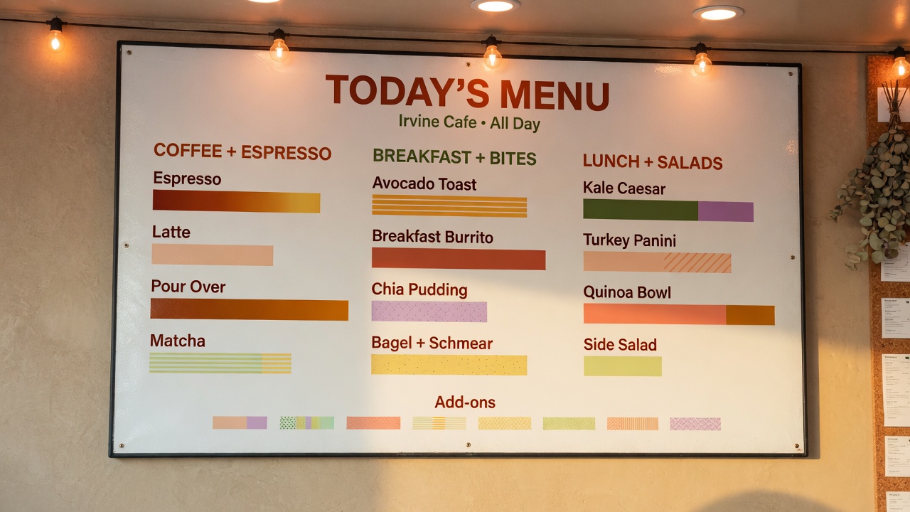
Restaurant menu boards Irvine operators actually use are UV-printed rigid panels, not peeling laminate sheets taped to the wall. Use changeable strips for prices and daily specials; reprint the whole board when the layout or the brand changes. Avanti Printing at 15321 Barranca Pkwy, Irvine, CA 92618 prints those boards. Quotes confirm size, material, quantity, finish, and date.
The guest does not care which press you used. The guest cares whether the board can be read from the queue, whether last week’s price is still sitting there in a Sharpie, and whether the surface looks like it belongs in a dining room or in a locker. Direct UV-cured ink on a rigid sheet is how we make that object. The sheet, the finish, and whether you reprint the whole face or only a strip are the job. Get those right and the board disappears into service. Get them wrong and you own a glossy rectangle that glares at 5 p.m., a laminate that curls at the corners, or a full reprint every time the branzino price moves.
We print this work on an Océ Arizona 460 GT at 15321 Barranca Pkwy. The bed takes rigid stock up to 4×8 feet. Most dining-room boards are much smaller than that. The rest of this article is the part catalogs skip: changeable strips versus a full reprint, glare in Irvine glass boxes, what Orange County Environmental Health actually cares about versus what operators invent, and which faces survive sanitizer, grease, and a west window. It is not a card-coating article, not a short-run press-family comparison, and not a hanging-vinyl spec. If the object is a posted menu, keep the ticket on flatbed UV printing on rigid menu boards.
Who this is for in Irvine and Orange County dining
You are shopping restaurant menu boards Irvine style because a GM, a chef, or a landlord said the wall has to carry the offer, and then went quiet on how often the offer changes. Typical callers from Irvine, Tustin, Costa Mesa, Lake Forest, Laguna Hills, Santa Ana, and Newport Beach are independent operators, multi-unit GMs, hotel F&B, food-hall kiosks, and the person who inherited a peeling laminate and a roll of packing tape.
Drive-in radius is local. We are at 15321 Barranca Pkwy, Irvine, CA 92618. Call (949) 387-0787. Operators around Irvine Spectrum Center, Diamond Jamboree, University Center, Park Place, Woodbridge Village Center, Quail Hill, the Irvine Business Complex lunch strip, and medical plazas on Barranca and Alton treat this as a counter job. If the board has to ride to a patio at the Spectrum or a suite in University Research Park, say so before we print a 48×96 you cannot stand on edge in a sedan.
This guide is for California buyers who will own the wipe-down and the next price change. It is written in second person because you are the one who will stand in the queue at 11:45 a.m. and decide whether the type is large enough. It is not for someone collecting mood boards. If the graphic is actually a window film, a sidewalk A-frame insert, or a light-box translucent, say that. Those are related products, not the same ticket.
- Independent restaurants and cafes that reprint seasonally and scribble daily specials until the wall looks like a pantry list.
- Counter-service and QSR rooms where the board is the menu, the queue is eight feet of glass, and calories may be a legal line, not a design flourish.
- Full-service dining rooms that want a host-stand board, a bar list, and a kitchen-posted copy that will not steam apart.
- Food halls, ghost-kitchen pickup shelves, and hotel restaurants that share a corridor and a sign program.
- Operators at Diamond Jamboree and other Irvine dining clusters who need bilingual layouts and still have to fit calories, a consumer advisory, and a happy-hour column on one face.
If you are a home-based caterer in Woodbridge or Northwood, a wall-mounted commercial board in the garage is still a sign to an HOA. We will print it. The architectural committee will not grade us on wipeability.
Changeable strips versus a full reprint
Start here, not with a PDF named MENU_FINAL_v18. Restaurant menu boards in Irvine fail more often from the change plan than from the ink. If three prices move every week and the layout is stable, you wanted strips. If you redesigned the sections, the photography, and the brand mark, you wanted a full reprint. Mixing those instincts is how you buy a board twice.
| System | What actually changes | Honest use | Do not use it for |
|---|---|---|---|
| Full UV reprint on a rigid face | The entire layout: sections, photos, type, brand | Seasonal menus, a rebrand, a board that is stable for months | Daily fish prices, a happy-hour column that moves every Thursday |
| Channel / rail strips | Individual lines that slide into horizontal channels on a printed or painted backer | Item names and prices that swap without touching the header | A photograph-heavy face, or a layout that is not built to a strip pitch |
| Magnetic strips on a steel or magnetic-receptive backer | Printed magnets you can slap on and pull off | Specials, 86s, a chef’s list, a bar that rewrites three lines a night | A high-abuse pass where magnets walk into the dish pit |
| Snap-frame insert | The whole printed face inside a frame; hardware stays | Monthly or seasonal full-menu swaps without reprinting a panel | Line-by-line changes; you will still reprint the entire insert |
| Marker / letter board | Whatever the closer writes at 10 p.m. | A genuine daily board next to a stable printed header | Your only menu, if you need calories, an advisory, or a brand that looks finished |
Those rows are shop practice, not a franchise manual. The print is the easy half. The pitch of the rail, the height of the strip, and the type size that still reads at the back of the queue are the spec. If you skip the pitch, we can still print pretty rectangles. They will not enter the channel.
When a full reprint is the cheaper honest answer
Operators love strips in theory and hate them when the header is Garamond, the new strips are Arial, and the prices sit a pica off the dollar signs from last year. A full UV print on a rigid board is cheaper than a strip system when you are changing more than a handful of lines, when the photography is the product, or when you do not have staff who will seat a 1-inch styrene strip square at 7 a.m. Count the lines that will actually move in ninety days. If it is most of the board, reprint the board. If it is the market-fish row and two desserts, build a rail.
Full reprints also win when the board is small. An 18×24 bar list that changes monthly does not need a channel chassis. Print it, hang it, replace it. A 36×48 dining-room feature with a brand header, six sections, and three food photographs is the opposite: lock the header on the backer, put the volatile lines on strips, and stop paying to reprint the photographs because the soup price moved.
Snap frames sit in the middle. You reprint a thin insert — often 3 mm PVC, sometimes a mounted sheet — and the aluminum frame stays on the wall. That is a full-face change without a full-panel hang. It is still a reprint of everything inside the frame. Do not call it a strip system. Call it a seasonal face. Outdoor-rated frames only if the hang sees sun or a patio. Interior snap frames chalk and seize on a west storefront. We print the insert. You still have to own a frame that was meant for a restaurant, not a cubicle.
Channel strips: pitch, height, and the file you actually need
A channel system is a backer plus horizontal rails. The backer can be UV-printed with the brand, the section headers, the consumer advisory, and the calorie succinct statement. The rails take printed strips: typically thin styrene or thin PVC, sometimes a paper insert in a sleeve. Strip heights in this trade commonly land around 3/4 inch, 1 inch, 1.5 inch, and 2 inch. Those are typical industry sizes, not a promise that your existing rail is any of them. Measure the opening, not the marketing name of the rail.
The file is a template, not a poster. Each strip is a tiny document with a name, a price, maybe a calorie figure, maybe a modifier. Alignment is everything. If the price column must stack as a vertical row of dollars, every strip needs the same tab stops. We can build that template. You cannot send twenty separate Word files named “new price” and expect the column to land. Send a list: item, price, calorie if required, section, strip height. We impose to the pitch.
Reprint only the strips that changed. Keep a small overage. Strips get greasy, they get bent going into the rail, they get lost in a drawer. A 24-strip set with two extras is shop practice. A 24-strip set with no extras is how you reprint one line at rush because someone folded a styrene under a ticket spike.
Two-sided strips exist if the rail is open on both faces, which is rare on a wall. Almost every dining-room rail is one view side. Print the view side. Do not pay for a back that sits in a channel.
Magnetic strips are the cousin for rooms that rewrite a short list. We UV-print magnetic sheet, or we print a magnetic-receptive backer and the magnets separately. Magnets that are too weak walk. Magnets that are too thick will not sit flush and will glare. Say how many lines, how often they move, and whether a kid can reach them. A pass-through specials board at arm’s height is a different product from a seven-foot feature wall.
A strip system is a reprint plan with hardware. If you cannot name the strip height, the number of rails, and who will seat the next change, you do not have a system. You have a hope. Full UV reprints are slower to change and faster to look finished. Pick one on purpose.
Laminated paper versus a rigid UV board
Health-department folklore in kitchens is louder than the code. Orange County Environmental Health inspects food facilities so food is safe, surfaces are clean, and what you advertise is what you serve. They want a current menu, a consumer advisory where CalCode requires one, and surfaces you can actually clean. They do not issue a spec that says “must be UV-printed ACM.” Operators who tell you the inspector “requires lamination” are usually remembering a conversation about a filthy, torn paper sheet, not a materials standard.
Start with what is actually written. Covered chain establishments — restaurants and similar retail food establishments with 20 or more locations, same name, substantially the same menu items — must put calorie counts on menus and menu boards under the FDA’s menu labeling requirements (21 CFR 101.11). That rule also wants a succinct daily-calorie statement and a line that additional nutrition information is available upon request, placed clearly on the menu board. Independent Irvine rooms are often not covered. Multi-unit groups sometimes are. If you are covered, the board is labeling, not decoration. Build the calories into the layout. Do not leave a 6-point afterthought in a gloss highlight that nobody can read from the queue.
California Retail Food Code also wants a consumer advisory for raw or undercooked animal foods: disclosure on the item, plus a reminder about foodborne-illness risk. That language lives on the menu or menu board, not in a binder in the office. If your board is the menu, the advisory is part of the print. If the table booklet is the menu and the wall is a photo mural, put the advisory on the booklet and stop pretending the mural is a menu.
Orange County Environmental Health food-safety pages are explicit that inspections look at whether foods are advertised and labeled accurately and truthfully. A wall that still lists a dish you 86’d in March is not a print defect. It is an operations defect that happens to be on our substrate. Plan check for a new or remodeled facility also wants a menu with the drawings. That menu is the food list, not a requirement that the guest-facing board be paper.
What laminated paper actually does
Table menus are still often paper in a laminate pouch or a plastic sleeve. That product has a job: it is cheap, it is replaceable when it walks out the door, and a server can wipe it. The failure mode is the edge. Cheap pouches peel. The peel becomes a soil collector. Inspectors notice dilapidated menus the same way they notice a cracked cutting board — as a cleanliness and care problem, not as a font problem. If you insist on laminated paper at the table, replace it before it looks biological. That is not a UV-board conversation.
The mistake is treating a laminated letter-size sheet as a wall menu. Tape, push pins, and a pouch on a painted wall in a Spectrum-area dining room looks like a pop-up. The pouch curls in HVAC. Kitchen steam lifts the edge faster. Sanitizer creeps into the peel. You now have a paper sandwich that cannot be wiped honestly. A rigid UV board is the wall product. Laminate is the handheld product. Stop using one as the other.
Kitchen-posted copies are the other paper habit. Chefs want a list over the expo. Steam, grease film, and a spray bottle of degreaser will destroy paper, and they will destroy a cheap pouch. A small rigid PVC or ACM panel with a gloss-enough face you can actually wipe is the posted-kitchen product. Keep it out of the splash of the dish machine. Direct UV ink on a sealed face survives a wipe. It does not survive a steel pad and oven cleaner. Say how it will be cleaned on the quote if the hang is over a range line. We would rather add a clear coat than watch you sand the ink off with a green pad in week two.
What a rigid UV board actually does
Direct-to-board UV puts the ink on the object. There is no pouch to peel. There is no paper core to cockle. You can wipe a properly coated face with the sanitizer you already use on non-food-contact surfaces. That is the cleanliness argument, and it is a practical one, not a citation. The board still has to stay current. A beautiful 36×48 that lists last summer’s prix fixe will not charm an inspector who is looking at truth-in-menu.
Rigid is also the glare, the mount, and the brand. A laminated pouch never looks like a designed wall. A UV-printed PVC, ACM, or acrylic panel can, if you pick the face for the lighting. That is the next section. Do not order rigid because you think it is a health-department loophole. Order it because you want a wipeable, readable, current board. Then keep it current with strips or with a reprint cycle you will actually follow.
Handheld and wall can live in the same room. Many Irvine full-service rooms want a small table booklet plus a bar board plus a host-stand specials panel. Those are three products. The booklet can stay paper. The wall should not. If you try to make one laminated legal-size sheet do all three jobs, you will hate all three.
Substrates that survive a dining room
The sheet is the second decision after the change plan. The same art is four different products on 3 mm PVC, on 6 mm PVC, on 3 mm ACM, and on 1/4-inch acrylic. If your email says “menu board” and attaches a PNG, you have not specified a job. The table below is shop practice for guest-facing and kitchen-posted work in Orange County interiors, not a warranty table.
| Face | What it is | Where it behaves | Watch-outs |
|---|---|---|---|
| Expanded PVC, 3 mm | Foamed PVC; light, smooth, easy to cut | Snap-frame inserts, small bar lists, seasonal faces | Thin; can oil-can near heat; not a patio monument |
| Expanded PVC, 6 mm | Stiffer cousin; still plastic | The default indoor dining-room board on standoffs or screws | West sun through glass will still move a large dark sheet |
| ACM, 3 mm | Aluminum skins on a core; flat, sign-shop default | High-wipe rooms, patio-adjacent, long hangs, kitchen-posted | Needs real fasteners, not an H-stake; edge shows a core stripe |
| Acrylic, often 1/8–1/4 in | Clear, white, or colored plastic with a glass look | Host-stand features, bar backs, rooms that want an object | Glare; fingerprints; not the first choice over a fryer |
| Thin styrene strips | The insert in a channel rail | Line-by-line changes | Bends; grease in the rail; must match pitch |
Thickness is part of the name. “PVC menu board” without 3 mm or 6 mm is a shrug. “Acrylic” without clear versus white, and without reverse versus first-surface, is how two quotes disagree and both are technically acrylic. Put thickness on the ticket with size.
Direct UV on these faces is the process we run on the rigid bed. Adhesion is generally good on the sheets we stock when they are clean and dry. It is not a powder-coat. First-surface ink will scuff if you drag a pan across it. A flood clear, satin or gloss, is the conversation for a pass-through board people will touch. It is not automatic. Say wipe-down and we will talk coat. Say “make it fancy” and we still need to know which face, because fancy on clear acrylic opposite a west window is how you hang a mirror.
For hangs that have left the dining room — a parking-lot directional, a monument panel, a suite plaque in a medical building that happens to contain a cafe — keep the menu ticket separate from rigid sign printing in Irvine. Different hardware, different permission, sometimes a different sheet. A cafe hours panel on the corridor glass of an Irvine Company building is a sign-program problem that happens to list soup.
PVC for interiors that actually change
Six millimeter expanded PVC is the board I specify most often for indoor restaurant menu boards in Irvine when the hang is on a dining-room wall, the face is light-colored, and you will reprint in a season or two. It is smooth. Type holds. Photographs do not pick up a flute. It takes a screw with a washer, a standoff, or a frame. It is lighter than ACM. It is not a metal panel. A large dark 4×8 of 3 mm PVC in a sun-loaded storefront will take a bow. ACM was invented in part so you could stop having that conversation.
Three millimeter belongs in a snap frame or as a small insert, not as a 36×48 floating on four decorative caps. If you want a seasonal face you swap yourself, 3 mm in an outdoor-or-indoor-rated frame (match the hang) is the right product. If you want a feature that looks like architecture, step up.
ACM when wipe, heat, or a patio is in the brief
Aluminum composite stays flatter, takes a beating from carts and keys better than PVC, and is the honest patio-adjacent sheet. Irvine patios along Spectrum walkways and Diamond Jamboree sidewalks are still Orange County sun. Unshaded exterior is not an interior PVC job. ACM on a wall, in a cabinet, or on standoffs is. Solid aluminum is the next step if a specifier already wrote plate, or if a cart will treat the board as a bumper. Most operators do not need plate. They need a flat, wipeable face and fasteners that match a stucco or a stud.
Kitchen-posted boards lean ACM or 6 mm PVC with a coat you can degrease. Do not hang a polished acrylic slab over a range hood and then ask why it looks like a fingerprint museum. The kitchen copy can be ugly and still be correct: large type, current, wipeable, two screws, done.
Acrylic when the board is an object
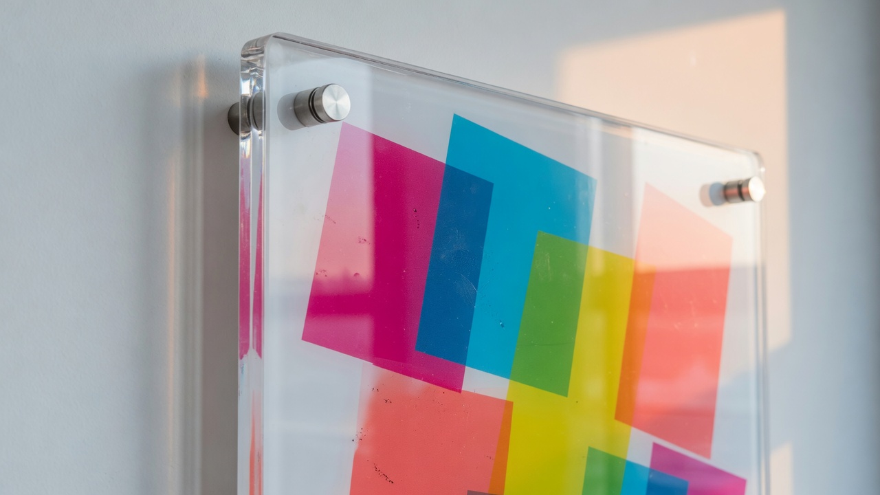
Clear reverse-printed acrylic is the host-stand look: you view the ink through the sheet, the face wipes as plastic, the edge can polish. White acrylic behaves more like a rigid paper and is kinder to brand color. Both glare if the sheet is gloss and the room is a lantern. Frosted or satin acrylic cuts that. If the dining room is glass on two sides — a common Irvine Spectrum and University Center condition — sample satin before you commit a 36×48 of polished clear. We can print a small corner on gloss and satin. The sample is cheaper than a board nobody can read at 6 p.m.
Reverse print on clear is a stack: mirrored color, then white. Send the file right-reading. We will flip it. A silent pre-flip is how a wine list reads backward. First-surface on white acrylic is simpler and scuffs sooner. A clear coat helps. It does not make acrylic a cutting board.
If the graphic is larger than a rigid parent, or if you actually wanted a wall of photography behind a small menu object, large-format printing for oversized menu graphics is the other press family in the building. A 10-foot mural with a 24×36 UV menu on top of it is two line items. Do not mash them into “just make the wall the menu.”
Glare: the board you cannot read
Irvine dining rooms are glass, downlights, and west sun. That combination is harder on a menu board than the ink chemistry is. Gloss UV ink on a gloss sheet opposite a window wall is a second window. Guests photograph the reflection of the Spectrum parking structure. They do not photograph the prix fixe.
Walk the hang at the worst time, not at 10 a.m. with the blinds down. For many Irvine storefronts that time is late afternoon, when west and south glass dump light across the queue. For rooms with tight downlights, it is every evening: each can becomes a hot spot on a gloss face. Stand where the guest stands. If you have to tilt your head to find the price, the board failed before we talked about CMYK.
Three levers, in the order that actually works:
- Sheet finish. Matte or satin PVC, matte ACM, frosted or satin acrylic. The plastic is the first mirror. Changing the ink gloss on a still-gloss sheet is a partial fix.
- Ink and coat. A satin or matte flood clear kills some specular bounce and adds wipe toughness. Gloss clear wipes like a tabletop and throws light like one. Pick the room, not the catalog photo.
- Geometry. Angle the board a few degrees off the window axis. Move it out of the downlight beam. Lower it so the guest is not looking up into a can. A perfect print in the wrong rectangle of the wall is still a mirror.
Matte is not free. It can hold fingerprint oil as a dull smudge that gloss would have let you wipe to nothing. High-touch host stands often want a satin middle: less glare than gloss, less staining than a paper-dry matte. Kitchen boards that only the expo reads can stay glossier because the viewing angle is short and the wipe is constant. Guest queues cannot.
Illuminated cabinets are a different glare problem. A light box with a translucent face is roll-fed film or a backlit substrate, not a first-surface UV board pretending to be a lamp. If the landlord already built a menu cabinet on the patio, measure the daylight opening and the lamp type, then specify a backlit graphic. Forcing an opaque UV PVC into a light box is how you hang a silhouette. Say cabinet, say backlit, say size. We will steer the process. We will not silently print an opaque 3 mm and hope the LEDs invent translucency.
Night glare from interior lighting is the one operators miss because they approve proofs under an office LED. Approve a material sample in the room, at service, or you are approving a PDF. A PDF does not have a west window.
Quote UV restaurant menu boards
Type, calories, and the copy the board must carry
A menu board is a reading task at a distance. Designers who build it like a website will set 10-point descriptions and a hero photograph of a burger. The queue will see the bun. They will not see the price. Viewing distance sets type. A common sign-industry starting point is about one inch of cap height per ten feet of viewing distance. That is a typical industry range, not a code table and not a substitute for standing in your room with a tape. Counter queues in Irvine fast-casual rooms are often in the 6 to 12 foot band. Dining-room feature walls can be 15 feet and up. Patio boards read from farther if you expect someone to decide before they open the door.
Hierarchy that survives a Friday night:
- Section headers large enough to scan without hunting.
- Item names the next size down, still readable from the back of the queue.
- Prices aligned, not hidden in a script flourish.
- Descriptions optional at counter; if you need them, give them their own size, not 70 percent gray on a photograph.
- Calories, if required, adjacent to the item or price, in a typeface that is actually conspicuous — the FDA rule says clear and conspicuous, not “we found a corner.”
- Succinct 2,000-calorie statement and “additional nutrition information available upon request” on covered menu boards, typically at the bottom, not in a footer you cropped off.
- Consumer advisory for raw or undercooked items, with the asterisks actually pointing at the items that need them.
- Allergen notes as your brand requires; California chain allergen rules have been moving, and a board is a bad place to be a year behind counsel. If you are a covered chain, ask counsel. We will set the type you give us.
Bilingual boards are normal in this city. Diamond Jamboree, portions of the Spectrum, and a lot of Irvine independent rooms run English plus Chinese, Korean, Japanese, Vietnamese, or Persian. Two languages double the line count. They do not double the wall. Either the board grows, the descriptions die, or you split to two panels. A 24×36 with two languages, calories, modifiers, and a photograph is how you print 8-point type and then blame the printer. Say languages up front. We will tell you the board is too small before we RIP it.
Photographs of food on a gloss face do two things: they sell, and they show every bit of compression in a phone JPEG. Shoot for print or do not shoot. A social-media export stretched to 20 inches on satin ACM looks like a social-media export. Rigid gloss is happy to show you that. If the food photography is the brand, budget for it. If the brand is type, skip the photo and gain line count.
QR codes as a supplement are fine. A QR as the only menu, on a covered establishment that still needs calories on the board, is not a workaround. Put the legal lines on the board. Put the PDF behind the code if you want. A 0.6-inch QR in a busy photograph at 12 feet is a decoration. Quiet field, size a phone can focus from the distance you actually expect, or skip it.
Files, finishes, and what the bed needs
Good boards die in prepress as often as they die in the window. The printer is not confused. The file was built for Instagram.
Send vector for names, prices, and marks: PDF, AI, or EPS, fonts outlined. Photographs can be raster. For a board people stand six to ten feet from, 150–200 ppi at output size is a typical industry band. A host-stand panel at two feet wants more. A 72 ppi web hero stretched to 36×48 on gloss ACM will look like a web hero. Work in CMYK. RGB neons are a monitor event. If a brand red must hit a coated PMS number, say the number and understand the ground: that chip was printed on white paper. On black acrylic, on brushed ACM, and on a stained wood backer with printed strips, the same ink recipe is a different visual. Approvals that matter should be on the actual face.
Bleed: 1/8 inch past trim if ink goes to the edge and we cut after print. Safe type: keep live copy off standoff caps, off frame lips, off rail overlaps, and off the bottom few inches if someone will install a ticket ledge. A phone number or a QR under a 3/4-inch cap is a reprint.
White channel: a spot color or a layer named WhiteInk, 100 percent where white ink should print, when the sheet is not a white ground. Black acrylic, clear acrylic, brushed ACM, and colored PVC all need this decision. White in a CMYK file is a hole. On those faces, the hole is the sheet.
Strip jobs need a template plus a data list, not a flattened poster with the prices baked in so nobody can edit line 14. If we are matching an existing rail, measure strip height, rail opening, backer size, and the reveal. Bring a dead strip if you have one. A photo of a wall with a phone and no tape is not a measurement.
Finish belongs on the quote, not in a text after pickup: first-surface versus reverse, gloss versus satin versus matte, flood clear or not, edge (saw, framed, polished), holes (count, diameter, offset), standoffs or screws or a frame, single-sided unless the panel projects. Two-sided menu boards exist on a bar blade. They need a blockout if light will sit behind them. A single flood of white on 3 mm PVC is not a blockout in a sunlit storefront.
Notes that belong in the email: finished size (width × height, view-side); sheet and thickness; strip system yes/no and pitch if yes; indoor, patio, or kitchen; glare concern if you already know the window; quantity; date. If the boards are versioned (bar versus dining, English versus bilingual, breakfast versus dinner), that is a template plus a list, not four files named FINAL.
Irvine rooms, landlords, and patio sun
Local color only matters when it changes the sheet, the type, or the permission. These do.
Glass boxes. Spectrum, University Center, Park Place, and a lot of IBC ground-floor rooms are glass on the queue side. That is a glare spec. It is also a heat spec for dark PVC. Sample the face. Do not approve a gloss acrylic PDF.
Landlord criteria. Irvine Company retail and many Spectrum-area leases already decided what may sit in the storefront, whether a patio easel is allowed, and whether a menu cabinet on the exterior is even your wall. Interior dining-room boards inside the suite are usually yours. The glass at the lease line is often not. A 36×48 in the window is a sign. Ask for the criteria PDF before we print a window-facing reverse acrylic that the property manager will ask you to pull.
Patio and sidewalk. ACM or a rated cabinet, not interior 3 mm PVC on foam tape. Wind walks A-frames. Take them in. City and landlord sidewalk rules still apply; we print inserts, we do not issue a right-of-way. If the patio board is actually a rigid panel on a post, treat it as outdoor rigid sign printing with a menu as the copy, not as a dining-room leftover that escaped.
UCI and campus-adjacent. Student lunch rooms want speed, calories if you are covered, and boards that survive a semester of backpacks. Fine-dining acrylic is the wrong default. 6 mm PVC or ACM, satin, large type, strips for the weekly special. Campus facilities rules still win in public corridors.
Hotel and medical cafe. Shared corridors, approved vendors, and a sign program that already specified suite plaques. Your menu board inside the cafe can still be yours. The directional in the garage is not a menu ticket.
Kitchen steam and sanitizer. Post a small rigid, not a paper packet. Keep it out of direct steam. Degrease with what the face can take. If the night crew uses a Scotch-Brite on everything, say so. We will talk coat, or we will talk a cheaper face you are willing to reprint when they sand it.
HOA and home kitchens. A catering menu on a garage wall in Turtle Rock is still a commercial look to a neighbor. Read the CC&Rs. We will still print.
None of that changes the press. It changes whether you should order gloss clear acrylic because a hotel in a different city used it.
Mistakes that reprint a menu board
Reprints on these jobs hurt because you paid for a board, a cut, sometimes rails, and a hang, not only for ink. The pattern is boring and preventable.
- Laminated letter paper on the wall. Edges peel, tape fails, the room looks temporary. Use a rigid face on the wall.
- A full reprint every time one price moves. Build strips or a snap-frame insert. Or accept a printed “market price” line like an adult.
- Strips that do not match the rail pitch. They buckle or they rattle. Measure the opening.
- Header type on the strips, body type on the backer, three typefaces, no tab stops. The wall looks like a ransom note. One template.
- Gloss acrylic opposite west glass. Unreadable at dinner. Satin or a different sheet, and stand in the room before you approve.
- Type sized for a laptop, not for the queue. Prices disappear. Use distance, not taste.
- Calories and the advisory added in 6-point after the designer “finished.” On a covered board that is a labeling miss, not a style choice.
- RGB food photos at 72 ppi. The burger looks like a mosaic. On a matte face it looks like a mosaic with glare removed.
- No white channel on clear or black acrylic. The logo is a stain. Build the channel.
- Interior PVC on an unshaded patio. Bow, chalk, a tired plastic. ACM or a cabinet.
- Foam-core or a paper-faced interior board in the kitchen. Grease and steam eat the edge. It is the wrong object. This is a restaurant-abuse note, not a lobby-materials catalog.
- Overtightened caps on acrylic, or screws without washers on PVC. Cracks and pull-through. Hardware is finish.
- Landlord surprise in the storefront. The print is fine. The glass was never yours. Check the binder.
- Missing size, material, quantity, finish, or date. You get a range instead of a price, and a board the day after the menu launch.
Stacking printed PVC face-to-face in a hot trunk deserves its own sentence. The boards will scuff. Slip sheets, or keep the masking on until hang. Peeling acrylic masking in a dusty lot and then standing the panel on gravel is how a “defective” edge becomes dirt in the polish. Peel at install, on a clean surface.
What to send so the quote is real
Send one email a person can estimate from. If you skip fields, you get a range, not a price. Walk-ins Monday–Friday, 8:00 a.m. to 5:00 p.m. at 15321 Barranca Pkwy, Irvine, CA 92618 are welcome if you bring a dead board, a dead strip, or a tape-measured size. You can also start on the Irvine Printing site with the same fields. Quotes confirm size, material, quantity, finish, and date. Add the change plan and the lighting on this product line so we do not guess.
- Size. Width × height, view-side, in inches. If it sits in a cabinet or a snap frame, the daylight opening and the intended clearance.
- Material and thickness. PVC 3 mm / 6 mm; ACM 3 mm; acrylic thickness and clear/white/frosted; styrene strips; or “recommend from hang and change plan.”
- Quantity. Identical versus versioned (bar / dining / kitchen / languages). Strip count plus extras.
- Finish and hardware. First or second surface; gloss / satin / matte; flood clear; edge; holes; standoffs, screws, frame, or rails; rail pitch if strips.
- Change plan. Full reprint cycle, snap-frame inserts, channel strips, or magnets. How often lines move.
- Site. Dining wall, host stand, bar, kitchen, patio, window. Facing if there is glass. Covered chain labeling yes/no if you know it.
- Date. The day it must be on the wall for a menu launch, not “ASAP.” Rails, reverse acrylic, and bilingual templates are not a while-you-wait counter job. A small PVC bar list with a clean file is a different clock.
Attach the file or say you need a rebuild. State pickup versus crate versus hang. State whether a brand manager, chef, or landlord must approve a proof. If an existing rail or frame is staying, send a photo with a tape in the opening. We would rather print to your hardware than guess a 1-inch strip for a 7/8-inch channel.
If the same launch also needs window film, a patio panel, or a wall mural, list those as separate lines. Different process, different file, different finish. Mixing them into one “just make the menu” instruction is how interior PVC gets specified like a patio cabinet, or a cabinet gets specified like a table tent.
Send menu-board specs for pricing
Questions operators ask before they hang a board
Do I need changeable strips or a full UV reprint?
Strips if a minority of lines will move and you have a rail pitch you will live with. Full reprint if the layout, the photography, or most of the items are changing, or if the board is small enough that a monthly reprint is simpler than hardware. Snap-frame inserts are a full-face reprint without a new panel. Magnets are for a short, abused specials list. If you cannot name how often the copy moves, you are not ready to buy rails. Print a rigid board, run it for a month, then decide whether the Sharpie on the corner is a strip system waiting to happen.
Will Orange County Environmental Health accept laminated paper menus?
They will accept a current, accurate, reasonably clean menu. They are not a print-spec department. Laminated table menus are common and fine until they peel and look filthy. Laminated paper as a wall board is a cleanliness and presentation problem waiting for an inspector who is already looking at truth-in-menu. Rigid UV boards wipe without a pouch edge. They still have to stay current, carry a consumer advisory when CalCode requires one, and carry calories if you are an FDA-covered establishment. Do not hang a board because you think it is a loophole. Hang it because you can wipe it and read it.
How do I stop glare on a menu board in an Irvine glass dining room?
Change the sheet first: satin or matte PVC, matte ACM, frosted acrylic. Add a satin clear if the hang is high-touch. Then move the board off the bounce of west glass and out of a downlight beam. Approve a material sample in the room at service, not a PDF in an office. Gloss reverse-printed acrylic opposite Spectrum-area afternoon sun is a mirror with prices trapped inside it. We can print that mirror. You should not order it once you have stood in the queue.
What material should I use for dining-room versus kitchen-posted versus patio?
Dining room: 6 mm PVC or 3 mm ACM, satin if there is glass; acrylic only when the board is an object and you have sampled glare. Kitchen-posted: ACM or 6 mm PVC with a wipeable coat, large type, no photography required. Patio: ACM or a rated cabinet with the correct graphic process; not interior PVC, not a paper pouch. If the patio piece is a post-and-panel, it is a sign with menu copy. If it is a light box, it is a backlit graphic, not an opaque UV board.
Do calories have to be on my Irvine menu board?
If you are a covered establishment under FDA menu labeling — generally a chain of 20 or more locations with the same name and substantially the same items — yes, on menus and menu boards, plus the succinct statement and the additional-nutrition line. Independent rooms often are not covered. Voluntary posting is still a layout problem: if you put calories on, put them where a guest can read them. We do not decide coverage. We set the type you are required or you choose to carry. Bring the legal lines with the item list, not as a postscript after the proof.
What files and type size do you need?
Vectors for names and prices, CMYK, white as a spot or layer when the sheet is not white, actual size or a labeled scale, bleed if we cut after print, holes on their own layer, strip templates if rails. Photos at a sensible ppi at size. Type sized for the back of the queue, not for your laptop. A spreadsheet of items, prices, and calories plus a brand PDF is a better start than a flattened poster. Rebuild time is design time. Put rebuild / not rebuild on the quote with size, material, quantity, finish, and date.
Can you match an existing strip system or snap frame?
Yes if you measure it. Bring a dead strip, a caliper reading on the opening, and the backer size. Rails are not as standard as people think. A 1-inch strip in a 22 mm channel is a buckle. We can print styrene or thin PVC to the height you measured, with tab stops that match the last set if you send one. Matching a three-year-old ink color on a sun-faded backer is a conversation: reprint the backer, or accept that new strips will look newer. Do not expect a spectro reading from a faded wall to invent last year’s magenta.
How fast is this, and can I wait at the counter?
A small PVC bar list with a clean file is a different clock from a bilingual 36×48 reverse-printed acrylic with a rail template, a satin coat, and a landlord proof. Rush exists when the sheet is in house, the file is clean, and the finish is simple. Rails, polished edges, and data-driven strips are not while-you-wait business cards. Put the needed-by date on the quote. “We change the menu Monday” is a date. “ASAP” is not. Call (949) 387-0787 if Monday is already too close; we will say yes or no.
Hang a board you can wipe and read
Restaurant menu boards Irvine operators keep are a change plan plus a face plus a room. Direct UV on PVC, ACM, or acrylic is how we put the offer on an object you can wipe. Channel strips, magnets, and snap-frame inserts are how you stop reprinting the photographs because the soup moved. Laminated paper stays at the table. Gloss stays off the west glass unless you have stood in the queue and still want it. Calories and the consumer advisory belong in the layout when the law or the item list says they do, not in a 6-point afterthought.
Avanti Printing is at 15321 Barranca Pkwy, Irvine, CA 92618. (949) 387-0787. Bring size, material, quantity, finish, and date. Bring the rail pitch, the window, and the item list if you have them. If the file is ready, we can talk like an estimator instead of a mind reader. If it is not, say that too. The board will still be here. It will work longer if we do not have to guess whether your “menu board” is a pouch, a patio cabinet, or a 6 mm panel with a satin coat and two extra strips in the drawer.