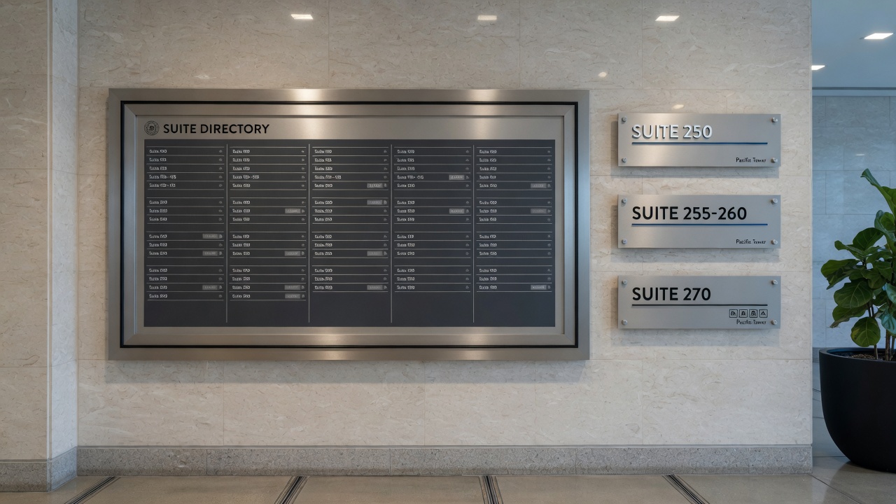
Lobby signs Irvine offices need are a system: suite numbers, a lobby directory, and wayfinding that matches the landlord program. ADA tactile copy belongs on permanent room IDs; we print it, we do not certify it. Avanti Printing at 15321 Barranca Pkwy, Irvine, CA 92618 prints those panels. Quotes confirm size, material, quantity, finish, and date.
The search phrase sounds like one product. On the counter it is four: a suite number at the door, a tenant list in the elevator lobby, arrows that get a visitor from the garage to the correct floor, and the hours or check-in copy inside your suite. Mash those into one “lobby sign” PDF and you will either violate a sign program, hang a pretty rectangle nobody can read from the elevator, or order tactile braille on a directory the Access Board does not even ask you to braille. Get the objects, the owner of the wall, and the copy type right, and the building starts to make sense. Get them wrong and you own a stack of plaques the property manager will not let you install.
This is a wayfinding article, not an acrylic catalog, not a foam-board roundup, and not a press-family comparison. We put graphics on rigid faces in the same building as rigid sign printing in Irvine. The job is the system: which panels you are allowed to hang, which copy is a permanent room label, and which copy is a name that will change when the lease does. Call (949) 387-0787 if you already have a dead directory insert in the car and want the next one specified like an estimator instead of a mood board.
Who this is for in Irvine office parks
You are shopping lobby signs Irvine offices because a landlord, a GC, or a managing partner said the suite has to look finished, and then went quiet on who owns the corridor wall. Typical callers from Irvine, Tustin, Costa Mesa, Lake Forest, Laguna Hills, Santa Ana, Newport Beach, and the John Wayne Airport office corridor are office managers, facilities people, tenant-improvement coordinators, medical and dental administrators, law-firm office managers, and property staff who inherited a directory that still lists a company that left in 2022.
Drive-in radius is local. We are at 15321 Barranca Pkwy, Irvine, CA 92618. Buyers from the Irvine Business Complex, University Research Park, Spectrum-area office, medical suites on Barranca and Alton, and Jamboree-corridor parks treat this as a counter job. If the panels have to ride a passenger elevator to a tenth-floor lobby, say so before we print a 36×48 you cannot turn in the cab.
This guide is for California buyers who will own the hang, the next tenant change, and the conversation with the property manager. It is written in second person because you are the one who will stand in the elevator lobby with a visitor who cannot find Suite 240. It is not for someone collecting reception photography. If the graphic is actually a window film, a parking-lot monument, or a wall mural behind the desk, say that. Those are related products, not the same ticket.
- Tenants in Irvine Company parks who were handed a criteria PDF and a 4×8-inch plaque spec and still need the names spelled correctly.
- Property managers who need a building directory that can drop a departed tenant without reprinting the whole wall.
- Medical, dental, and therapy suites on Barranca, Alton, and Culver that need suite numbers, practice names, and hours without turning the corridor into a retail storefront.
- Law firms, accountants, and professional offices that share a floor and a card reader, and need the visitor to find the right glass door.
- TI contractors and architects who already drew a signage schedule and need the printer to follow that sheet instead of inventing a look.
If you are a home-based business in Woodbridge, Turtle Rock, or Northwood, a commercial suite plaque on a garage is still a sign to an HOA. We will print it. The architectural committee will not grade us on braille spacing.
Four lobby objects, one system
Start with the objects, not with a file named LOBBY_FINAL_v11. Lobby signs in Irvine offices fail more often from mixing products than from the ink. A suite number is not a directory. A directory is not a restroom sign. Hours on reception glass are not a corridor plaque. If your email says “lobby signs” and attaches a PNG, you have not specified a job. The table below is shop practice for leased Orange County interiors, not a warranty table and not a legal opinion.
| Object | Where it hangs | Who usually owns the wall | Copy that actually lives there | Do not use it for |
|---|---|---|---|---|
| Suite ID / room number | Latch side of the suite door, or the landlord’s specified plaque location | Landlord program first; tenant inside the suite | Permanent number or room name; occupant name as a changeable line if the program allows it | A full brand mural, a menu, a window cling on glass you do not own |
| Elevator-lobby directory | Shared lobby, elevator alcove, or a specified kiosk | Property manager / landlord | Tenant list by floor, suite, or alphabet; vacant slots left honest | Tactile braille on fifty names, a one-piece panel you will reprint at every move-out |
| Directional / you-are-here | Corridor intersections, garage-to-lobby, stair discharge into the floor | Landlord or campus; sometimes the tenant on a private floor | Arrows, floor IDs, restroom and conference pointers, a map with a you-are-here mark | A 6-point legal dump, a photograph of the site plan with no hierarchy |
| Hours, visitor, check-in | Inside the suite, on a desk panel, or on glass the lease actually gives you | Tenant | Informational copy: hours, ring doorbell, suite Wi-Fi is not a wayfinding system | The only identification for the suite if the corridor already has a program plaque |
Read the owner column twice. In an Irvine office park the prettiest panel is still illegal if it sits on a corridor the criteria book already specified. Inside your suite you have more freedom. On the public face of the floor you have a sign, and someone else may already own the look. Quotes still confirm size, material, quantity, finish, and date. On this product line they also confirm who has to approve the proof.
Thickness and substrate come after the object. The same tenant list is four different products as paper strips in a frame, as magnetic bars on a steel backer, as a full UV reprint on 6 mm PVC, and as a 3 mm ACM panel screwed to a garage wall. Pick the change plan with the object. A law firm that restacks twice a year does not want a diamond-polished slab with fifty names fused into the face. A restroom door does not want a paper insert.
A lobby program is a reprint plan with addresses. If you cannot name the suite plaque, the directory, the directional, and who is allowed to touch each wall, you do not have wayfinding. You have a stack of rectangles.
Ask the landlord before you pick a look
Irvine is a planned city with a planned attitude toward signs. That attitude is stricter in office parks than buyers from other counties expect. Check three desks, in this order: landlord or property manager, then the City if the sign is visible from the public side, then us. Printing first is how plaques sit in a closet.
Office parks — especially Irvine Company properties around the Spectrum, Jamboree, the Irvine Business Complex, and University Research Park — usually have a sign program. Suite-door plaques, directory strips, monument slots, and even the typeface on the elevator directory may already be specified: size, material, mounting, sometimes an approved vendor. Your custom 12×18 logo panel may be allowed inside the suite and forbidden on the corridor. A floating reception object in a shared lobby can also be a problem if it was never in the criteria book. Ask the property manager for the PDF before we cut anything that will live on their drywall.
Typical constraints we actually see, without pretending every campus uses the same numbers:
- Specified plaque size and insert. Many corridors use a fixed backer or frame. You reprint the insert, not the architecture. Measure the daylight opening. Do not send “standard suite sign.”
- Specified typeface and layout. If the binder shows a stacked number over a name, we follow that stack. A brand font on the corridor is often a no.
- No applied vinyl on corridor glass. Hours and logos on the suite-side of your own glass can still be a criteria fight. Window film is a different process under large-format printing for window and wall graphics. Do not smuggle it in as a “lobby sign.”
- Approved hardware only. Standoffs, tape, and decorative caps that look like a hotel in another city may be banned. The program may want painted heads, a specific barrel, or no new holes at all.
- Approved vendors in common areas. Some parks want their installer in the elevator lobby. We can print and you can hand the stack to their vendor. Say that on the quote so we do not schedule a hang we cannot perform.
- Monument and parking ID. Building names, lot letters, and tenant slots on a monument are almost never a tenant DIY. Those are landlord or City conversations that happen to include a printed face.
Medical buildings on Barranca and Alton add a second binder: hospital or professional-building criteria on top of the park rules. Practice names, suite numbers, and after-hours instructions are normal. A 24×36 photograph of a smiling team on the corridor is often not. HIPAA is not a print spec, but a directory that lists a provider who left, or a temporary paper that names a patient-facing program in a public hall, is an operations problem that happens to be on our substrate. Keep patient names off wayfinding.
Inside the suite, the rules relax and the lighting gets worse. Downlights, west glass, and white walls will glare a gloss directory you approved as a PDF. That is a finish problem, not a landlord problem. The landlord problem is the corridor. Solve the corridor first. Then we can talk about the reception object.
The City of Irvine treats many exterior signs as a permit question. Interior suite plaques and elevator directories usually are not a City counter job. A panel on the building face, a monument slot, or a sign visible from the public right-of-way can be. Start at the City’s sign rules for Irvine when the object leaves the lobby and faces the street. Wall signs typically need an elevation, dimensions, and the length of the leased frontage. We can print to a permitted drawing. We cannot issue the permit, and we will not tell you a storefront logo is “probably fine” because it is a good print.
UCI and other campus facilities have their own brand and facilities rules. A department suite ID is one queue. A public-corridor wayfinding panel is another. Bring the spec they already wrote. Anaheim, Costa Mesa, and Newport jobs that still pick up on Barranca bring their own city rules; do not assume Irvine’s packet applies. The constant is the quote: object plus location plus permission.
ADA copy we print without a fake certificate
This is the section buyers want as a stamp, and the section we will not fake. Avanti Printing prints signs. We are not an accessibility consultant, not a certified inspector, and not the Authority Having Jurisdiction. We will not invoice an “ADA-certified” plaque. We will not put a seal on a packing slip that says the building now complies. If your TI package, your landlord, or your consultant already wrote a signage schedule, we print to that schedule. If you need a determination of what the building must provide, that determination is not a RIP setting.
The U.S. Access Board’s Guide to the ADA Standards, Chapter 7: Signs is the readable version of scoping most people actually mean when they say “ADA signs.” Read it once before you order tactile on everything in the lobby. The Standards do not require you to label every room. They require that when certain signs are provided, those signs meet visual and, in some cases, tactile criteria. They also exempt whole categories that tenants keep trying to braille.
Exempt from those visual and tactile requirements, per that guide: temporary signs posted for seven days or less; building addresses and directories; occupant names and company names and logos; menus; seat or row designations; and signs in non-public areas of detention facilities. That list is why a building directory is a readability job, not a braille job, and why the practice name on a suite plaque is not automatically a tactile line. Room numbers and permanent room names are a different row.
| Copy type | Typical lobby example | What the Standards are driving at (plain language) | What we need from you |
|---|---|---|---|
| Permanent room or space ID | Suite 240, Conference A, Restroom, Stair 2, Mechanical | Where provided, visual and tactile (raised characters plus Grade 2 braille), mounted in the specified zone | The exact permanent name or number, a mounting location, and whether visual and tactile are one plaque or two |
| Occupant / company name | The practice or company name under the suite number | Often treated as exempt occupant content; many landlord programs still want it on the same plaque as a visual line | Whether the name is changeable; whether the program wants it on the tactile plaque or on a separate insert |
| Directory | Elevator-lobby tenant list | Exempt from the tactile/visual sign requirements in that guide; still has to function as a list people can read | The live roster, sort order, vacant-suite policy, and the frame or backer size |
| Directional / informational | Arrows to restrooms, hours, visitor check-in, “employees only” | Where provided, visual criteria (contrast, non-glare, character height by viewing distance); not tactile | Viewing distance, hang height, and a finish that is not a mirror |
| Required exit / certain restroom IDs | Tactile EXIT at specified egress doors; restroom pictograms with text descriptors | Often landlord- or code-driven; restroom pictogram fields have their own geometry if you provide a pictogram that labels the room | The code sheet or the existing plaque you are matching; do not invent an EXIT legend because it looks official |
Those rows are a printer’s map of the Access Board language, not a determination that your suite is or is not a place of public accommodation. California’s Building Code (Title 24, Part 2, Chapter 11B) can apply on tenant improvements that go through plan check. If your drawing set already has a signage schedule, that sheet wins over a conversation at our counter. If it does not, do not ask us to invent one that will survive an inspector. Hire the consultant or follow the landlord’s existing set.
What “tactile” means on a plaque we actually make
Tactile, in this trade, means raised characters you can read with a fingertip, plus contracted Grade 2 braille under that copy. The Access Board guide is specific: raised characters 1/32 inch minimum; uppercase; sans serif; no italic, script, or decorative faces; character height commonly 5/8 inch to 2 inches when the same characters also serve as visual, or 1/2 inch minimum if visual characters live on a separate sign. Braille sits below the raised text, not beside it, with a 3/8 inch minimum from the raised characters and from raised borders. Dots are domed. A decorative font with a “Braille” OpenType feature in a desktop file is not Grade 2 braille. Do not send that and call it done.
Mounting is part of the product. Raised characters and braille sit in a height band: 48 inches minimum from the finish floor to the baseline of the lowest tactile character, 60 inches maximum to the baseline of the highest. At a single door, the sign belongs on the latch side. An 18×18 inch clear floor space, centered on the tactile characters, needs to sit beyond the door swing to 45 degrees. Card readers, fire strobes, vision lites, and the millwork the landlord already hung will fight that rectangle. Measure the wall. A perfect plaque on the hinge side because the latch side had a reader is a placement miss, not a print miss.
Finish and contrast matter when the same characters are the visual characters: non-glare face, light-on-dark or dark-on-light. The Standards do not hand you a contrast ratio to tattoo on the invoice. Higher contrast reads better for low vision. Gloss UV on a gloss sheet opposite a downlight is how you fail the non-glare idea while still having a pretty proof. Satin or matte faces are the default I want in an Irvine glass lobby. Gloss is a reception object conversation, not a corridor-ID conversation.
Pictograms that designate a permanent room, when you provide them, want a field at least 6 inches high, with the tactile text and braille below that field, not inside it. The International Symbol of Accessibility has its own rules when the Standards require it. Do not drop a wheelchair mark on a directory because it felt inclusive. Put it where the schedule says.
How we raise the copy is a fabrication choice: photopolymer, raster (raised beads), or a constructed plaque with applied tactile. Each can be specified. Each can also be specified badly. Vinyl stick-on letters that mash down to nothing are not 1/32 inch raised characters. We will tell you when a method does not belong on a permanent room ID. We will still not stamp the building. If an inspector or a consultant wants a particular construction, we build that construction. If you want the cheapest raised look on a party-room door for a weekend, that is a different product, and it is not a restroom ID.
Two plaques are sometimes the honest answer: a tactile ID that stays when the tenant name changes, plus a visual name insert. One plaque with a number that never changes and a name that changes quarterly is a hardware problem. Design the change. Do not glue fifty names into a process that cannot lose one.
Suite numbers that survive tenant churn
The suite number is the permanent room designation. The company name is the line that will be wrong next year. Design the plaque for that fact. Irvine office parks already learned this; that is why so many corridors use a fixed number with a replaceable name strip. If you are building a new set, copy that logic even if you are allowed a custom look inside a private floor.
Measure the specified location, not the neighbor’s plaque from a phone photo. Typical suite IDs in this trade are small: often in the 4×8, 6×6, 8×8, or 8×12 class, sometimes a 12×18 on a more generous wall. Those are typical industry sizes, not a promise that your campus uses any of them. The binder wins. If there is an existing frame, measure the insert: width, height, thickness, and how it retains (tape, magnet, slide-in, screw caps). A 1/8-inch insert in a 1/16-inch channel does not enter. A paper insert in a humid vestibule curls. PVC or a thin ACM insert is the adult version of that paper.
Copy hierarchy that survives a visitor with a phone in one hand:
- Suite or room number large enough to read from the corridor, not from a laptop.
- Occupant name the next size down, or on the changeable insert only.
- Nothing else on the corridor plaque unless the program allows a small mark. Taglines, QR codes, and “a member of” lines belong inside the suite.
- Keep-out zones for standoff caps, frame lips, and the card reader that will be installed after you hang the sign.
If the plaque is a permanent room ID, the number (and any permanent room name) is the tactile content. The occupant name can stay visual-only. That split is how you avoid reprinting braille every time the dba changes. If the landlord insists one plaque, one look, we can still raise only the number and keep the name as flat visual, provided the layout leaves the braille zone clean. Do not run a script logo through the braille margin.
Hardware is finish. Screws with painted heads, hidden pins in an existing backer, or a slide-in insert: pick one that the wall is allowed to receive. VHB on dusty eggshell in a common corridor is how you get a floor plaque and a paint scar. If the program says no new holes, the answer is their frame, not our optimism. Glass-mount hardware on corridor storefront is a permission problem. A lot of Irvine glass is not yours.
Matching the floor matters more than matching your business card. A floor of mixed 8×8 metals plus one tenant’s 18×24 acrylic logo is how the property manager starts a conversation you will not enjoy. If you want a brand object, put it inside the suite on a wall you control. Corridor IDs are wayfinding. They should look like they belong to the building first.
Variable copy is a template plus a list, not twelve files named FINAL. Twenty suite plaques with different names and the same layout are one setup. Twenty unique layouts are twenty setups. Send a spreadsheet: suite number, occupant name (and the line-break you actually want), floor, whether the suite is vacant. Vacant should say vacant, or show the number only, or show “available” if leasing wants that. A directory that still lists a ghost tenant is how visitors knock on a dark door.
Directories: strips, occupancy, and the elevator wall
The elevator-lobby directory is the panel visitors actually use, and it is the panel property managers hate reprinting as a monument. Directories are exempt from the tactile sign requirements in the Access Board guide. That does not make them a dump of 8-point names on gloss PVC. It makes them a list: readable, current, and built to change.
Change plan first, same as a menu board, except the “prices” are tenants:
| System | What actually changes | Honest use | Do not use it for |
|---|---|---|---|
| Full UV reprint on a rigid face | The entire list and often the header | A small directory that is stable for months, or a rebrand of the building | A 40-tenant tower that restacks every quarter |
| Slide-in strips / channel rails | One tenant line | The default multi-tenant lobby if you will actually seat the strips square | A photograph-heavy “brand wall” that is not built to a pitch |
| Magnetic bars on a steel or magnetic-receptive backer | Lines you can pull off | Leasing offices and floors that shuffle monthly | A low, public wall where magnets walk home in a backpack |
| Paper or thin PVC in a lockable frame | The whole printed face; hardware stays | Smaller lobbies, monthly updates, a map-plus-list combo | An unframed letter on the wall with push pins |
Strip pitch is the spec buyers skip. Measure the opening, not the marketing name of the rail. Common strip heights in this trade land around 1/2 inch, 3/4 inch, 1 inch, and 1.5 inch. Those are typical industry sizes, not a promise that your existing rail is any of them. Bring a dead strip. We impose names to that height with tab stops so suite numbers stack as a column. Twenty Word files named “new tenant” will not stack.
Sort order is a property-manager decision, not a design flourish. Alphabet by occupant, by floor then suite, or by suite only: pick one and keep it. Mixing sorts is how two directories in the same tower disagree and the visitor takes the wrong elevator. If the building has a you-are-here map plus a list, the list still needs a unique suite number the map can point at. A map without numbers is art.
Type size follows viewing distance. A directory read from six feet in an elevator alcove can live on smaller caps than a wall read from the security desk across a two-story atrium. The Access Board visual-character table ties minimum cap height to hang height and viewing distance; 5/8 inch is the floor for many near, mid-height signs, and the number climbs as the sign gets higher or farther. That is a code table for signs that must meet visual criteria, and a good habit for directories even though directories are exempt. If you have to lean in and squint, the directory failed before we talked about CMYK.
Non-glare is not optional in an Irvine glass box. Elevator lobbies along Jamboree and the IBC are downlights, polished stone, and storefront. Gloss ink on gloss sheet is a second window. Satin PVC, matte ACM, or a satin flood clear is the face I want on a directory. Approve a material sample in the lobby at 5 p.m., not a PDF in an office.
Header lock, list flexible. Print the building name, the address, and the floor legend on the backer. Put tenant lines on strips. That is how you stop reprinting the header because Suite 310 moved. Keep a small overage of blank strips. A 24-line directory with two extras is shop practice. A 24-line directory with no extras is how you tape a paper name in the gap at rush.
Do not braille the directory. Occupant names are exempt, directories are exempt, and a field of domed dots under fifty 1/2-inch names is a fabrication fantasy that helps nobody who actually reads braille. Put tactile IDs at doors. Put a readable list on the lobby wall. If a consultant wrote something else on a drawing, we will follow the drawing. We will also still say the drawing is unusual.
Garage and after-hours directories are a different climate. A list in a parking structure wants ACM or a rated cabinet, not interior 3 mm PVC on tape. Exhaust, sun through the opening, and irrigation overspray at the ramp are Orange County, not a museum. If the garage panel is actually an exterior sign, treat it as outdoor rigid sign printing with a tenant list as the copy.
Quote suite numbers and lobby directories
Directional signs and you-are-here maps
Directional copy is how a visitor who already read the directory still gets lost. Arrows to restrooms, conference, loading, and the accessible route are informational signs. Where provided, they want visual criteria: contrast, non-glare, a character height that matches how far away people stand. They do not want braille. Putting tactile on an overhead arrow is how you spend money in the wrong place.
You-are-here maps fail from the file, not from the press. A full architectural floor plan with every plumbing chase, printed at 18×24, is unreadable. Simplify: public corridors, suite numbers, restrooms, elevators, stairs, the you-are-here mark, north or a landmark. Color-code floors only if the building already color-codes them. A legend that needs a legend is not wayfinding.
Viewing distance sets the panel size. A map above a fire-extinguisher cabinet at eye level can be modest. A map across an atrium is a large-format problem. If the visual is bigger than a rigid parent, or if you want a wall-sized simplified plan, large-format printing for oversized lobby maps is the other press family in the building. A 10-foot mural with a 24×36 UV directory beside it is two line items. Do not mash them into “just make the wall the directory.”
Arrow discipline: one arrow style, one meaning. Filled arrows, not doodles. Confirm they still point correctly after a restack. The most expensive directional we reprint is the one that still points at a conference room that is now a storage closet. Walk the path. Stand where a first-time visitor stands after they leave the elevator, not where the architect stood in the CAD model.
Garage-to-suite is the path Irvine buildings get wrong. The visitor parks in structure B, walks a covered colonnade, enters a lobby that serves two addresses, and needs a floor. If your wayfinding only starts at the suite door, you lost them at the garage elevator. Coordinate with the landlord on lot letters and building IDs. Tenant-only arrows in a shared garage are how you get a complaint and a removal notice.
Overhead signs in circulation paths still owe people headroom. The Access Board notes an 80-inch minimum clearance for objects over a circulation path. That is a building conversation. It is also why a pretty hanging directory in a low elevator lobby is a bad idea even if it printed well. Wall-mount the list. Keep objects out of the headroom zone.
Bilingual directional copy is normal in this city. English plus Chinese, Korean, Japanese, Vietnamese, Persian, or Spanish shows up in medical and professional buildings constantly. Two languages double the line count. They do not double the wall. Either the panel grows, the descriptions die, or you split to two plaques. A 12×18 with two languages, arrows, and a map is how you print 8-point type and then blame the printer. Say languages up front.
Materials that belong in a leased corridor
The sheet is the second decision after the object and the landlord. The same art is different products on 3 mm PVC, 6 mm PVC, 3 mm ACM, a photopolymer tactile plaque, and a paper insert. If your email says “lobby signs” without a substrate, you have not specified a job. The table is shop practice for Irvine interiors, not a catalog of every board we load, and not a tour of acrylic thickness.
| Face | What it is | Where it behaves | Watch-outs |
|---|---|---|---|
| Expanded PVC, 3 mm | Foamed PVC; light, smooth | Directory inserts, snap-frame faces, small name strips | Thin; not a garage monument; can oil-can near heat |
| Expanded PVC, 6 mm | Stiffer interior default | Wall directories, interior directionals, reception lists | West sun through glass will still move a large dark sheet |
| ACM, 3 mm | Aluminum skins on a core; flat | High-wipe lobbies, garage-adjacent, long hangs, abuse | Needs real fasteners; edge shows a core stripe |
| Tactile plaque (photopolymer, raster, or constructed) | Raised characters plus Grade 2 braille on a specified backer | Permanent room IDs at doors | Not a directory product; not a certificate |
| Insert in an existing frame | Thin PVC, styrene, or paper in the landlord’s hardware | The most common Irvine corridor answer | Must match pitch, thickness, and retention; paper curls |
Direct UV-cured ink on those rigid faces is the process we run on the flatbed. Adhesion is generally good on the sheets we stock when they are clean and dry. It is not a powder-coat. First-surface ink will scuff if a cart rubs it. A satin flood clear is the conversation for a directory people will touch. It is not automatic. Say wipe-down and we will talk coat. For the bed envelope, registration, and what actually fits, that lives under flatbed UV printing on rigid lobby panels. This page is which object you should hang, not how the gantry thinks.
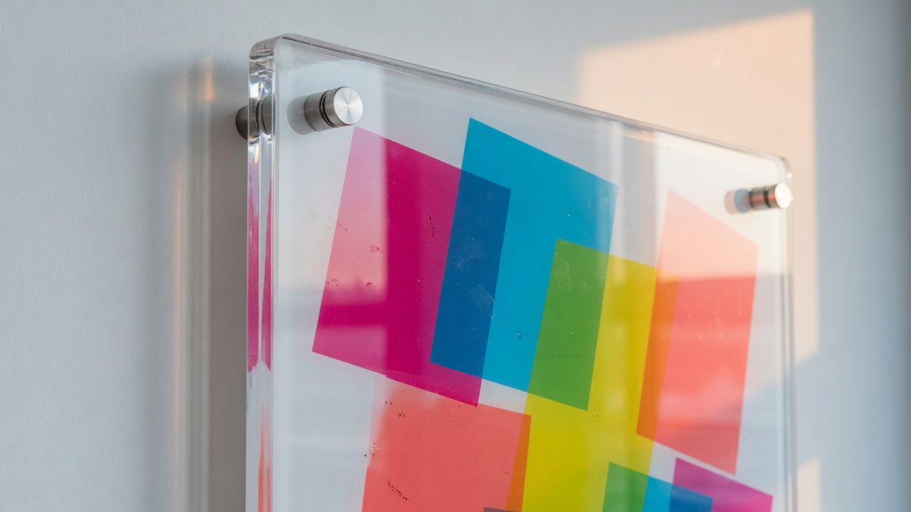
Acrylic belongs in a reception as an object, not as the default corridor ID. Reverse-printed clear with standoffs is a different ticket and a different article. If you want that object inside a suite you control, say so. If you wanted a 4×8-inch metal insert for an Irvine Company frame, do not upgrade yourself to 1/4-inch polished acrylic because a hotel photograph looked expensive. The property manager will not be moved. Foam-centered poster board is the other upgrade people try. It dents, it shows a paper edge, and it looks like a school project in a Spectrum-area lobby. Do not specify it for a permanent directory. Temporary, seven days or less, maybe. A tenant directory, no.
Applied vinyl on an existing landlord plaque is sometimes the correct cheap move: a name change on a specified backer, no new holes. It is also how you get a vinyl that peels at the corner in HVAC. If the backer is textured metal, vinyl is a fight. If the backer is a smooth insert, vinyl or a reprint of the insert both work; the reprint usually looks more intentional. Window vinyl on corridor glass is a criteria question first.
Hardware recap, because it reprints more jobs than color does:
- Existing frame or backer. Measure, reprint the insert, stop inventing holes.
- Screws with washers. PVC wants washers. Do not overtighten small plaques; this is still a corridor, not a furniture shop.
- Standoffs. Inside the suite, if allowed. In a common lobby, only if the program drew them.
- Tape. Small, light, short-term, clean paint you own. Not a 24×36 directory. Not a tactile plaque a hand will lean on.
- No-drill walls. Their frame, a desk sign, or a panel on a wall you actually lease.
Outdoor-adjacent faces — garage, porte-cochere, uncovered walk between buildings — leave the interior PVC behind. ACM or a specified metal blank, real fasteners, and a conversation about sun. Orange County west light through a garage opening will chalk a face that lived happily in a corridor. Say outdoor if it is outdoor. Do not call a garage interior because there is a roof.
Files, tenant lists, and versioned names
Good wayfinding dies in prepress as often as it dies on the latch side of the door. The printer is not confused. The file was a brand poster, or the list was a screenshot of an old Excel tab.
Send vector for numbers, names, and arrows: PDF, AI, or EPS, fonts outlined, logos as paths. Photographs can be raster if you insist on putting a photograph on a directory, which you usually should not. For a plaque people stand two feet from, 200–300 ppi at output size is the band we want. For a directory read from six to ten feet, 150–200 ppi is a typical industry band. A 72 ppi web hero stretched to 36×48 on gloss ACM will look like a web hero. Rigid gloss is happy to show you that.
Work in CMYK. RGB neons are a monitor event. If a brand color must hit a coated PMS number, say the number and understand the ground: that chip was printed on white paper. On brushed metal, on a specified bronze insert, and on a dark tactile backer, the same ink recipe is a different visual. Approvals that matter should be on the actual face. Landlord approvals should be on the actual layout the binder expects, not on a poster you wish they had specified.
The tenant list is a data file. Columns we can actually impose from:
- Building / floor
- Suite or room number (the permanent ID)
- Occupant name, with the exact capitalisation and the line break you want
- Secondary line if the program allows one (dba, “Ste 200” spelled out, suite range)
- Vacant yes/no, and what to print when vacant
- Sort key if it is not obvious (legal name vs dba)
- Language lines if bilingual
One spreadsheet plus one template beats twelve separate InDesign files named FINAL_v7. If the names are a legal matter, have counsel or the office manager sign off on spelling before we raise the copy. Reprinting a tactile plaque because someone wanted “and” instead of “&” is an expensive ampersand.
Bleed: 1/8 inch past trim if ink goes to the edge and we cut after print. Safe type: keep live copy off frame lips, off standoff caps, off strip overlaps, and off the braille zone. A suite number under a 3/4-inch cap is a reprint. If you do not know the cap diameter yet, keep a 1-inch keep-out in each corner until hardware is locked.
White channel: a spot color or a layer named WhiteInk, 100 percent where white ink should print, when the sheet is not a white ground. Black plaques, brushed metal, and colored PVC all need this decision. White in a CMYK file is a hole. On those faces, the hole is the sheet.
Braille is not a fill. If the plaque is tactile, we set Grade 2 from the specified English copy. If you already have a braille translation from a consultant, send it, and send the visual copy it matches. Conflicting files are how a restroom plaque says one thing in type and another in dots. We will not invent Spanish braille, Mandarin braille, or a decorative pattern that “looks like braille” from a font menu.
Notes that belong in the email, not in a Slack screenshot: finished size (width × height, view-side); object type (suite ID, directory, directional, hours); substrate and thickness, or “insert for existing frame” plus the measured opening; tactile yes/no and which lines are tactile; single or double-sided; holes; indoor or garage; quantity; date; who must approve (landlord, brand, GC). Photographs of a previous plaque, a website screenshot, and “it’s on the building directory, can you pull it” are not print files. Rebuild time is design time. Put rebuild / not rebuild on the quote with size, material, quantity, finish, and date.
Mistakes that reprint a wayfinding set
Reprints on these jobs hurt because you paid for a system, a cut, sometimes tactile, and a hang, not only for ink. The pattern is boring and preventable.
- Printing before the criteria PDF. The plaques are perfect. The corridor was never yours. Check the binder first.
- Tactile braille on a tenant directory. Directories and occupant names are the wrong place to spend a tactile budget. Put tactile at permanent doors.
- Occupant name fused into a plaque that cannot change. The dba changes. You reprint the number you did not need to reprint. Use an insert.
- Script, italic, or a decorative face on raised characters. That is not the tactile character style the Standards describe. Sans, uppercase, specified height.
- A desktop “braille font.” It is not Grade 2, the dots are not domed, and the spacing is wrong. Do not send it as the master.
- Wrong latch side, or a plaque in the door swing. Placement is part of tactile. Measure the reader, the strobe, and the swing.
- Gloss directory opposite lobby downlights. Unreadable at 5 p.m. Satin, and stand in the room before you approve.
- Type sized for a laptop. Suite numbers disappear from the elevator. Use distance, not taste.
- One full-bleed PVC for a 40-tenant tower. You will reprint the wall when one suite moves. Build strips.
- Strips that do not match the rail pitch. They buckle or they rattle. Measure the opening.
- Foam board or a paper-faced poster in a permanent lobby. Edges crush, it looks temporary, and it is the wrong object.
- Corridor glass vinyl the program forbids. The print is fine. The glass was never yours.
- Garage directional specified like an interior insert. Sun, exhaust, and abuse. ACM or a rated cabinet.
- You-are-here map that is a full CAD plan. Nobody can parse it. Simplify.
- Ghost tenants still on the list. Visitors knock on dark glass. Update the roster with the plaques.
- Missing size, material, quantity, finish, or date. You get a range instead of a price, and a stack the day after move-in.
Stacking printed PVC face-to-face in a hot trunk deserves its own sentence. The boards will scuff. Slip sheets, or keep the masking on until hang. Peeling a tactile plaque’s masking in a dusty lot and then standing it on gravel is how a “defective” face becomes grit in the dots. Peel at install, on a clean surface. Do not clean first-surface ink with a solvent wipe meant for mill oil.
Overtightened caps on a small plaque, and screws without washers on PVC, are the mechanical cousins. Star cracks and pull-through are not ink failures. Hardware is finish. Write it on the quote.
Irvine parks, medical corridors, and City permits
Local color only matters when it changes the object, the type, or the permission. These do.
Irvine Company and similar parks. Spectrum-area office, Jamboree, the Irvine Business Complex, University Research Park: criteria books, specified plaques, specified directories, sometimes specified vendors. Interior suite walls are usually yours. The corridor, the elevator lobby, and the monument are not. A 12×18 brand panel in the shared lobby is a sign-program problem that happens to be printed well.
Medical and dental on Barranca, Alton, and Culver. Suite numbers and practice names, often bilingual, often with after-hours copy. Keep the corridor calm. Hours belong on glass you control or on a desk panel. Directories in medical buildings go stale when providers change; build strips. Do not put patient-facing program names on a public directory unless operations asked for that on purpose.
Glass boxes. IBC ground floors and Spectrum-adjacent lobbies glare. Sample satin. Do not approve gloss acrylic as a directory because a reception object in another article looked good. This is not that article.
Parking structures and covered walks. ACM, real fasteners, larger type, weather. Interior PVC on tape is a leftover that will look like one. Lot letters and building IDs are usually landlord copy. Coordinate so your suite arrow does not fight their garage code.
UCI and campus-adjacent. Department suites can take a rigid ID. Public corridors and exterior campus faces are someone else’s program. Bring the spec. A conference-room name that changes every semester wants an insert, not a tactile rebuild.
City of Irvine. Interior directories and suite plaques are typically not a City sign permit. Exterior wall signs, monuments, and copy visible from the public side can be. Use the City’s sign pages when the object leaves the lobby. We print to the drawing. We do not stamp the permit.
HOA villages. Woodbridge, Turtle Rock, Northwood, University Park: a commercial suite plaque on a garage or a fence is a CC&R conversation. We will still print. Read the document.
Elevators and path. A 36×48 directory that prints cleanly can still lose to a 36-inch door or a passenger cab. Measure the path out of our shop at 15321 Barranca Pkwy and the path into the lobby. Tile if you must. A heroic panel cut in the garage is a waste of edge quality.
None of that changes the press. It changes whether you should order a custom object because a lobby in a different city used one.
What to send so the quote is real
Send one email a person can estimate from. If you skip fields, you get a range, not a price. Walk-ins Monday–Friday, 8:00 a.m. to 5:00 p.m. at 15321 Barranca Pkwy, Irvine, CA 92618 are welcome if you bring a dead plaque, a dead strip, or a tape-measured opening. You can also start on the Irvine Printing site with the same fields. Quotes confirm size, material, quantity, finish, and date. Add the object type, the landlord constraint, and the tactile split on this product line so we do not guess.
- Object. Suite ID, directory, directional, hours, restroom, or a mixed set. Separate lines if they are separate products.
- Size. Width × height, view-side, in inches. If it sits in a frame, the daylight opening, insert thickness, and retention method. A photo with a tape in the opening beats a phone app.
- Material and thickness. PVC 3 mm / 6 mm; ACM 3 mm; tactile construction; insert-only; or “recommend from hang and change plan.” Indoor versus garage.
- Quantity. Identical versus versioned. Suite list attached. Strip count plus extras. Vacant-suite policy.
- Finish and hardware. Gloss / satin / matte; flood clear; edge; holes; standoffs, screws, existing frame, or tape. Tactile yes/no, and which lines are raised plus braille.
- Permission. Criteria PDF if you have it. Landlord proof required yes/no. Approved vendor hang yes/no. City drawing if the object is exterior.
- Date. The day it must be on the wall for move-in or inspection, not “ASAP.” Tactile sets, strip templates, and landlord proofs are not a while-you-wait counter job. A small PVC insert with a clean file is a different clock.
Attach the file or say you need a rebuild. State pickup versus crate versus hang. State whether a brand manager, GC, or property manager must approve a proof. If an architect already drew a signage schedule, send that sheet. We would rather print to their numbers than invent a plaque that misses the embeds in the millwork.
If the same move-in also needs a wall mural, window film, or an exterior panel, list those as separate lines. Different process, different file, different finish. Mixing them into one “just make lobby signs” instruction is how interior PVC gets specified like a monument, or a tactile restroom ID gets specified like a poster.
Send the tenant list and plaque sizes for a quote
Questions buyers ask before they hang a directory
Do lobby directories in Irvine offices need braille?
Not under the Access Board’s scoping for directories. Building directories are listed among the signs that are exempt from those visual and tactile requirements. Occupant names and company logos are exempt too. What a directory needs is to be current and readable: contrast, a non-glare face, type sized for the alcove, and a change plan so departed tenants leave the wall. Put raised characters and Grade 2 braille on permanent room IDs at doors. If a consultant or a drawing set requires something else, send the drawing. We will print it. We will not invent a brailled fifty-name board because it sounded thorough.
Does my suite plaque need tactile numbers?
If you provide a sign that identifies a permanent room or space with a number or a permanent name, that identification is the kind of copy the Standards treat as visual and tactile. Occupant names on the same plaque are often treated as exempt content; many Irvine landlord programs still want the name as a visual line, sometimes on a changeable insert. Exterior signs not at the door they serve are a different case. We print to the program or the signage schedule you provide. We do not decide whether your particular suite is required to have a sign in the first place. If signs are provided, we will not flatten the number into a decorative script and call it a room ID.
Will you certify these as ADA compliant?
No. We will print raised characters, Grade 2 braille, contrast, and sizes to a specification. We will follow the Access Board geometry when that is the spec: 48 to 60 inches to the tactile baselines, latch-side placement, 18×18 clear floor space beyond the swing, sans-serif uppercase raised copy. We will not certify the building, the install, or the legal outcome. California plan check, a consultant, and the landlord’s existing set are the compliance path. Anyone selling you an “ADA-certified” sticker from a print shop is selling a sticker.
Can I put my logo on the corridor plaque?
Only if the sign program says you can. Most Irvine office-park corridors want a number, a name, and a quiet face. Logos, taglines, and brand colors on the public side of the floor are how you get a removal notice. Inside the suite, a reception mark is a different object on a wall you control. If the program allows a small mark, we will set it. If it does not, we will still tell you the binder wins. Do not order a custom 18×24 for a slot that takes a 4×8 insert.
How do I update a directory when a tenant moves?
If you built strips or magnets, reprint the one line and seat it square. Keep blanks. If you built a one-piece UV panel, you reprint the panel, or you accept a vinyl patch that will look like a patch. For a multi-tenant Irvine tower, strips are the cheaper honest answer. Send an updated spreadsheet, not a photo of the wall with a name circled. If leasing wants vacant suites to read as available, say that in the list so we do not print a hole that looks like a mistake.
What material should I use for suite IDs versus garage directionals?
Corridor suite IDs: the landlord’s specified insert, or 3–6 mm PVC, or a tactile plaque construction if the copy is a permanent room ID. Elevator directories: satin PVC or ACM in a frame, with strips if the roster moves. Garage and uncovered walks: ACM (or a specified metal blank), not interior PVC, not paper. Reception objects inside your suite can be a different substrate; do not drag that substrate into the corridor because it photographed well. If the panel is a post-and-panel at the driveway, it is a sign with wayfinding copy, not a lobby leftover that escaped.
What files and list format do you need?
Vectors for numbers, names, and arrows; CMYK; white as a spot or layer when the sheet is not white; actual size or a labeled scale; bleed if we cut after print; holes on their own layer. A spreadsheet of suite, occupant, vacant, and sort order plus a brand PDF is a better start than a flattened poster. Tactile jobs need the exact English copy that will be raised and brailled, and a note if visual and tactile are split. Rebuild time is design time. Put rebuild / not rebuild on the quote with size, material, quantity, finish, and date.
How fast is this, and can I wait at the counter?
A small PVC name insert with a clean file is a different clock from a tactile set for a floor, a bilingual directory with a rail template, a satin coat, and a landlord proof. Rush exists when the sheet is in house, the file is clean, and the finish is simple. Raised characters, Grade 2 braille, and data-driven strips are not while-you-wait business cards. Put the needed-by date on the quote. “Move-in Monday” is a date. “ASAP” is not. Call (949) 387-0787 if Monday is already too close; we will say yes or no.
Specify the system, not a pretty rectangle
Suite and lobby sign printing in Irvine is a system: suite numbers at the door, a directory that can lose a tenant, directionals a first-time visitor can follow, and hours inside the glass you actually control. Direct UV on PVC, ACM, inserts, and tactile constructions is how we put that copy on objects at 15321 Barranca Pkwy. ADA language belongs on permanent room IDs, to a spec, without a fake certificate. Landlord criteria books belong on the ticket before we cut. Directories stay readable and changeable. They do not become braille sculptures.
Avanti Printing is at 15321 Barranca Pkwy, Irvine, CA 92618. (949) 387-0787. Bring size, material, quantity, finish, and date. Bring the criteria PDF, the tenant list, and the measured frame if you have them. If the file is ready, we can talk like an estimator instead of a mind reader. If it is not, say that too. The stack will still be here. It will work longer if we do not have to guess whether your “lobby sign” is a 4×8 insert, a garage directional, or a tactile suite number on the latch side of the door.